
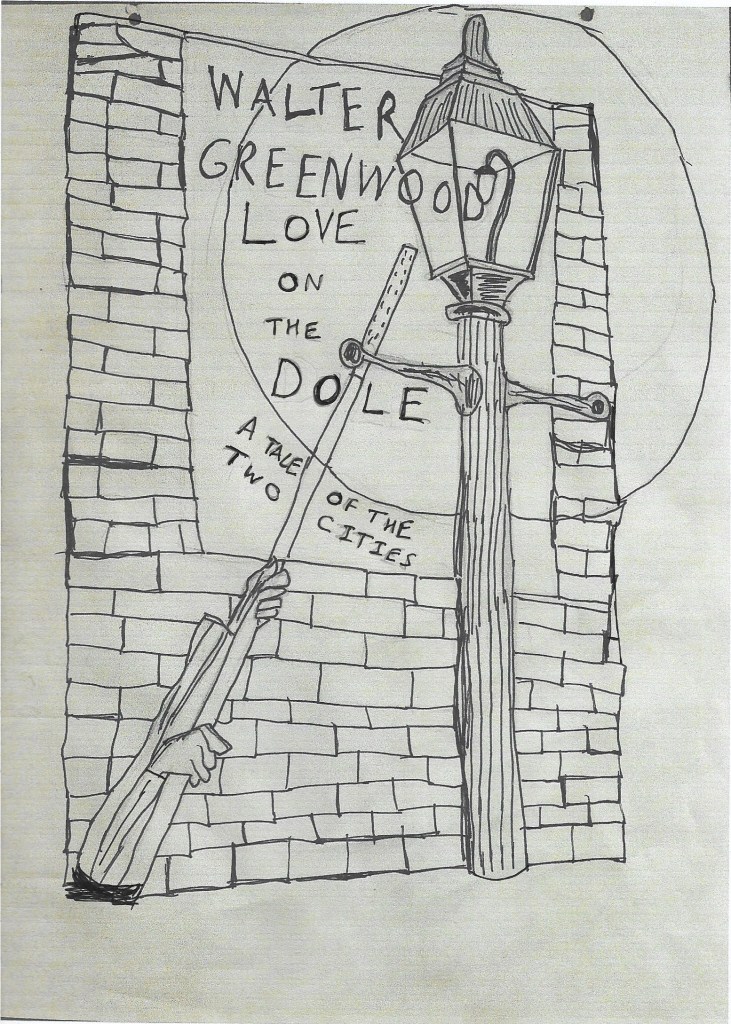
On 2 May 2025 I was pleased to acquire an original pencil sketch by Arthur Wragg which is evidently a first draft for a dust-wrapper of a Walter Greenwood book, though it was never actually used. The pencil sketch was kindly provided by gallerybs3 who had bought it at a studio sale auction in Cornwall of works by Arthur Wragg, 1903-1976 and his friend and fellow artist Frederick Roberts Johnson, 1900-1986 (auction held 13-14 February 2025 by Lay’s Auctioneers, Lanner, Cornwall). The design is unsigned but clearly in the style, or perhaps we should say one of the styles, of Arthur Wragg, and is firmly attributed to him by its sales context among other of his drawings and publications. The pencil sketch on cream paper is evidently unfinished, and while it features the name of the author Walter Greenwood it had not progressed to the point of including the book title! As a result, this verbal and visual account will necessarily have some speculative aspects, including imaginative (and indeed alternative) reconstructions of what form the final dust-wrapper illustration might have assumed, though actually some detective work on Greenwood’s text/s does make it fairly certain which of his books Wragg had in mind when he put pencil to paper.
The sketch is on a sheet of good quality drawing paper measuring 12 ins x 9 ins / 31 cms x 23 cms (with a portrait format). It has punched holes at the upper edge, suggesting it was at some point filed for safe-keeping. The drawing mainly occupies the upper three-quarters of the page, leaving unfinished areas in the bottom quarter, into which only (a rather roughly-sketched) pair of shirt-sleeved arms and hands project. Here is a scan of the original sketch, at slightly less than the actual size:
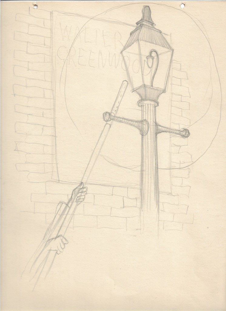
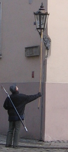
The subject is clearly the lighting of a street gas-lamp by a lamp-lighter, though we see only his arms and hands: the gas-lamp, the gas-lighter pole, an immediately adjacent brick building and perhaps an advertising poster dominate the image. In lieu of a nineteen-thirties British photograph (I cannot currently find one with appropriate copyright permissions), here is a photograph of a contemporary lamp-lighter carrying out the same task in Wroclaw, Poland, where the maintenance of the historic street gas-lamps has become something of a tourist attraction. This gas-light is wall-mounted on a bracket rather than on its own lamp-standard, but the lighting procedure with a long-handled lighter appears to be similar (though as it happens both lamps on brackets and on lamp-standards will recur in the article).
British towns and cities were increasingly lit by the modern industrial marvel of gas-lighting from the first decades of the nineteenth century on. In fact, the first use of gas to light a street was for a limited portion of Chapel Street in Salford, as a project undertaken by the adjacent Philips and Lee factory (see https://en.wikipedia.org/wiki/Gas_lighting). By the 1820s many industrial cities in Britain had gas street-lighting, though I have not so far found evidence of exactly when Salford’s streets were first more universally lit by gas street-lamps. Electric street-lights began in some places to replace gas-lighting towards the end of the nineteenth century, but many urban areas retained their gas-lighting through the thirties and forties and on into the mid-nineteen-fifties (see the fascinating general context given by the history of a gas-production company, William Suggs & Co: https://williamsugghistory.co.uk/the-end-of-street-lighting-by-gas-in-the-uk/). By the 1880s Salford’s streets were clearly gas-lit, for an anonymous correspondent of the Salford City Reporter complains that when travelling home to Salford from Manchester, he suddenly finds himself crossing from brightly-lit streets to much dimmer ones ‘where by the aid of the feeble street-lamp darkness is barely rendered visible’ (this plays on Milton’s poetic description of the fires of Hell which give off not light but ‘rather darkness visible’, Paradise Lost, I. 59, 1688). The reporter suspects that Salford is intent on saving money, and indeed on inspecting the gas-lamps sees that only one of the three burners in each is lit. The result is that ‘Salford is again made to play second fiddle to its neighbour’ (21 September 1889, p. 6). The same paper reported on 30 November 1889 that Salford Corporation had agreed to increase the amount of gas burnt per hour in its street lamps, despite the extra cost of over £2000 (p. 5). Earlier gas-lamps had each to be individually lit and extinguished, hence the occupation of lamp-lighter (though by the close of the nineteenth century automatic systems were beginning to be introduced – see https://en.wikipedia.org/wiki/Lamplighter).
Gas-lamps make a number of striking appearances in the streets of Hanky Park in Greenwood’s novel of Love on the Dole (1933), and lamp-lighters turn up to light them or extinguish them at two suitable points (presumably Salford even by the nineteen-thirties did not have the most up to date systems). The most prominent street-lamps are, as we might expect, at the dawn opening of the novel (well, it is chapter 2 because chapter 1 gives an introductory overview of Hanky Park) and its echoing dawn at the close of the narrative:
GETTING UP
5.30 A.M.
A drizzle was falling. The policeman on his beat paused awhile at the corner of North Street halting under a street lamp. Its staring beams lit the million globules of fine rain powdering his cape. A cat sitting on the doorstep of Mr Hulkington’s, the grocer’s shop, blinked sleepily.
‘Tsh-tsh-tsh-tsh-tsh,’ said the bobby and stooped to scratch the animal’s head. It rose, crooked its back, cocked its tail, pushed its body against his hand and miowed.
The melancholy hoot of a ship’s siren sounded from the Salford Docks. A man wearing clogs and carrying a long pole tipped with a bunch of wires came clattering down Hankinson Street. His back was bent, beard stained and untrimmed, his rusty black bowler hat was tipped over his eyes. Blind Joe he was called, though he never gave wrong change out of a shilling nor had need to ask his way about. Whether or no he actually was blind none could say; he was Blind Joe Riley, that was all . . .
The solitary lamp half-way down the street emphasized the enshrouding gloom and silvered the gently falling drizzle. . .The lamplighter was on his rounds extinguishing street lamps. The rain was ceasing (pp.13-14; p.18).
The street-lamp is part of the dawn atmosphere: the only other signs of life are the bobby nearing the end of his night-time beat, the naturally more-or-less nocturnal cat, the ship’s siren, and the ‘knocker-up’, Blind Joe, who wakes up the dwellers in each house, willing or not, for another day of work (if they have it) in Hanky Park, whether at home or the Works. His description and the uncertainty about his sight makes him sound like a figure of Fate, a mythical presence in an otherwise grimly real world: he will visit every house in turn, dealing out random lots, or perhaps even worse, the same lot to all.
After all the events of the story (Harry’s apprenticeship, sacking, hasty marriage, the Means Test protest march, Larry’s premature death, Sally’s desperate escape from Hanky Park) nothing has really changed for those who live in the city, as the largely repeated ending clearly signifies:
5.30 A.M.
A drizzle was falling.
Ned Narkey, on his beat, paused under the street lamp at the corner of North Street. Its staring beams lit the million globules of fine rain powdering his cape. A cat, sitting on the doorstep of Mr Hulkington’s, the grocer’s shop, blinked at Ned, rose, tail in air, and pushed its body against Ned’s legs.
‘Gaaa-cher bloody thing,’ he muttered, and lifted it a couple of yards with his boot. Then he glanced up and down Hankinson Street, afterwards footing it quietly to his house to rouse his wife. The idea of her lying abed whilst he was exposed to the raw elements annoyed him. Anyway, he would be finished work in a half hour; she should be up and preparing against his return . . .
A man wearing clogs and carrying a long pole tipped with a bunch of wires came clattering into North Street. His back was bent, beard untrimmed, rusty black bowler hat tipped over his eyes. He stopped at No. 17, raised his pole and laid the wires against the window, rattling them loudly against the panes (pp.255-6).
There are some variations on the opening passage: the unidentified constable’s place has now been taken by Ned Narkey, who has been corruptly appointed to the constabulary through Sam Grundy’s agency, and No 17 North Street is now the house rented by the young, married and already poor Mr and Mrs Hardcastle, that is to say, Harry and Helen and baby daughter. The changes though are either of no moment or are changes for the worse: the young Hardcastles look set to live out the same kind of subsistence life as the old Hardcastles, while Ned Narkey seems a much less trustworthy bobby, as we can see from his treatment of the cat and his envy even of his downtrodden and bullied wife. Those things apart, it still rains, the lamp still illuminates (in a sense) the street, and Blind Joe still wakes up working families (for more on Old Blind Joe see Walter Greenwood’s Workhouse Memories (1933 to 1967) * ).
The next reference to the street-lamps is to there having been just lit – on the bright side they allow children to play a bit longer and for the younger men to talk at street corners after dark (pp. 165-7). However, again here is a negative association with Ned Narkey and his dark deeds, for Sally meets Kate Malloy under the street-lamp where Kate tells her she is pregnant by Ned Narkey and Sally confronts Ned as he leaves the pub to tell him he must either marry Kate or pay under an ‘affiliation order’ (p.167). Narkey grossly and unconvincingly denies any responsibility, but thinks it will be cheaper to marry Kate than pay support for the child, since she can go back to work after the ‘confinement’. In fact, there is just one positive reference in the novel to street-lamps, with a link to Larry and Sally’s very different relationship. After Sally has listened to Larry’s political speech in North Street, there is the following passage:
She laughed, murmured something incoherently, then averting her gaze, said: ‘I was listening. But I don’t know nowt – er – anything about politics.’ She raised her eyes to his. The street lamp’s beams caught her upturned face, and enhanced, in the pale contrast of her skin the glowing darkness of her eyes. She blushed; thought she perceived an appreciative attentiveness in his gaze. Or was it imagination on her part? He had not yet answered; they still were looking at each other. She was embarrassed but could not avert her gaze (p.87).
The passage is focused on looking (and, of course, liking) though it also includes an element of embarrassment as Sally explores her response to Larry: in a short space the word ‘gaze’ is used three times, ‘eyes’ twice and ‘looking’ once. Since Larry has to give his political street-talks after work, it is inevitably dark by the time he has finished so here it is only through the street-lamp’s good graces that all these visual expressions, interpretations and exchanges can take place: ‘the street lamp’s beams caught her upturned face, and enhanced in the pale contrast of her skin the glowing darkness of her eyes’. However, this is the last and only beneficial piece of lamp-light in the novel. Next in sequence is as discussed above Sally’s lamp-lit attempt to mitigate the brutal exploitation of Kate Malloy by Ned Narkey and then comes the closing lamp-lit repetition which completes the novel’s loop.
The play-sets in both the Manchester and London productions also featured a street-lamp in Act II, Scene I, though the respective sets differed quite noticeably, as their stage-directions show. Here is the Cape-Manchester set-description:
An alley in Hanky Park. In the brick wall facing us is the entrance to a narrow passage. A street-lamp on a bracket. A dustbin stands against the wall, and there are a few tattered posters, giving racing news and offering large cash prizes. It is night and the lamp is lighted. We hear the mournful cry of a ship’s siren on the Ship Canal (p.53).
This is clearly a back-alley in the streets of Hanky Park (and indeed that is what the film set also stuck to – Deborah Kerr recalled that the ‘demon’ realist director John Baxter insisted on the dustbin being filled with authentic rubbish so that it smelt bad). (1) The set and the scene give the play’s version of the novel’s opening, complete with policeman, though relocated to a point almost half-way through the play. Once the policeman has gone on his rounds, there is an entire lamp-lit scene where Harry and Helen shyly begin courting. The scene ends as the light is ‘faded’ out; when the lights come up again they represent a daytime scene the next day (p.59). Though this scene is atmospheric, I am not certain the street-lamps had the same impact as in the novel with their marking of the lack of change between the opening and close of the narrative. Instead they show the positive and negative point that the only spaces in Hanky Park for private life and conversations were under the street-lamps at night-time. It may be that audiences for Love on the Dole on stage were struck by its night-time street-scenes and thus the street lamps because a great deal of British theatre and certainly London theatre at the time was still dominated by ‘middle-class drawing room drama’ which was of course set in interiors though that was not the only kind of set or genre convention in use (see D’Monte, Rebecca D’Monte, British Theatre and Performance 1900-1950, p. 245, Bloomsbury Publishing, Kindle Edition, 2015).
The Samuel French edition-London production of the play of Love on the Dole has a note stating that ‘This scene can be played in the simplest of settings. A drop cloth of a brick wall is adequate’, and the Manchester production had plainly already set a precedent for that. Nevertheless, the London production went for a larger-scale and grander set which stressed the industrial context of Hanky Park as well as its dark back-streets. Here is its stage-direction for Act II, Scene I:
An alley in Hanky Park. The R. half of the scene is occupied by a large railway arch, through which is seen a view of distant factories and other buildings, together with a railway line on which trains run at intervals. It is night [note, as above].
At the L. side of the arch is a street lamp on a bracket, which is lighted. Hardly discernable, in the feeble light, lies a drunken man (Mr Doyle) in the L. side of the arch.
The CURTAIN rises, and a train, with its coaches lighted up, is seen to cross the scene at the back, with its appropriate distant sound. (p.31)
This plainly gave the potential for some intriguing lighting effects for the spectator, which added a sense of mobile, and probably brighter, lighting to the feebler and static gas-lamp on the bracket. The view of the repeated moving trains through the arch might also have implied that modern life and commerce were passing Hanky Park by rather than including it (this is perhaps confirmed later in the same scene as Harry and Helen seeing a train pass both confess that they have never been on a train in their lives, and Harry wishes he had some money so he could take Helen away on a train for a holiday). Meanwhile within Hanky Park, the feeble lamp cast its light on a drunk, who is then collected by his wife (she clearly knows where to look). These are the Doyles, two characters who do not occur at all in the Manchester production-Cape edition. The Samuel French edition helpfully even provides a photograph of this set (as indeed of each of the play’s set in the Garrick London production of 1935).

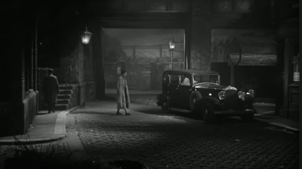
Though visibly constructed from painted canvas on a framework, this is nevertheless an impressive set giving a certain visual and contextual depth to Hanky Park. Several visual responses in cartoons suggested that this set, as well as its gas-lamp, were remarked and remembered at least by audience members with visual memories and imaginations. Note below in the two cartoons the effort invested in reconstructing the illumination, or partial illumination, by the gas-light of the railway arch and the characters underneath the lamp, as well as the effects of light, dark and smoke (and variably rain, if the diagonal hatching represents rain as well as dark – if so, evident in the first cartoon, but wholly banished in favour of a clearer night in the second).
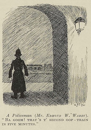

For a fuller discussion of the ‘cartoon’ responses see Love on the Dole: the Cartoons (February 1935)*
In fact, in neither edition of the play do Grundy and Sally talk at night under a street-lamp. This image brings into this night-time scene in Act II Scene 1 a conversation which is actually in the day-time Act II Scene 2. Here Grundy stops Sally in the street and tries to persuade her (with no success) that his intentions are honorable – an aim somewhat undermined by his trying to give her a handful of bank-notes, which she rejects. From the cartoonist’s point of view eliding the scenes means he can fit two more key characters from the play into his image. A later book cover from a 1956 Cape edition also pictures Grundy and Sally talking at night under a street lamp, something which again they do not do in the novel either. This image is unusual among the dust-wrappers for Love on the Dole in depicting Sam Grundy and Sally at the point where she has to make a dreadful decision about whether to accept Grundy’s gross deal. The illustrator pictures Grundy as deeply unattractive and indeed repellent, with his slicked-down (or combed-over?) hair and his sinister grasping hand just behind Sally. The bright yellow light of the gas-lamp (here one in a series seen along the street) casts the two faces into light and shadow, accentuating Grundy’s greedy look and Sally’s meditation on consequences. The cover is signed by Egon, but I have found little other trace of him. It is the only Love on the Dole dust-wrapper which draws on the pictorial conventions of popular romantic fiction.

Arthur Wragg’s sketch might be responding to the lamp-lit scenes in the novel, but he also might have been impressed by the stage-set lamps if he went to see the play, which seems very likely given his interest in the social issues of the time, and the fact that his friend Canon Dick Sheppard went and was very impressed by the play, asking to meet the author. I have checked all the other Greenwood novels from the thirties and forties, as well as The Cleft Stick stories, but have not found the same interest in street-lamps in any of them, so am reasonably confident that this is a Love on the Dole-related sketch.
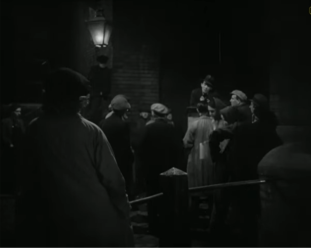
Whether it is more influenced by novel or play (or of course by both) may partly depend on the date of the sketch, but that is sadly unknown. Of course, if it dates to after 1941 then the film version may also be an influence. While there are street-lamps in several night-time scenes in the film, and these look to me to be influenced to a degree by the stage-set gas-lamps, they do not have quite the same thematic meanings as in the novel. Instead they signify, as in the play, the lack of places for comfortable privacy, but also give a definite romantic aura to these snatched moments of lamp-lit intimacy between Harry and Helen, Larry and Sally. As in the novel, Larry necessarily gives his political talk underneath a street-lamp, and this leads to what is apparently the first and certainly romantically charged conversation between him and Sally.

In fact, the street-lamps in the film are initially linked to the positive, and especially to the developing relationship of Larry and Sally. Thus when the couple return from their ramble on the moors, there is another lamp-lit scene as they say good-night in North Street.

However, the next lamp-lit scene is less optimistic as Sam Grundy pursues Sally in his car (for more on the part played by Grundy’s car in his persistent harassment of Sally see Sam Grundy’s Car: Sally Hardcastle’s Resistance (1933;1941)*). Sally tells Grundy to get lost and soon Larry arrives and walks her back to North Street, again under lamp-light. She tells him she is worried because she has heard that Ned Narkey threatened him at the Works. The two say their goodbyes just after they have passed by the infamous over-flowing dust-bin and are interrupted by someone singing. Larry says he hates having to stand in a back-alley. This is the last scene which is lamp-lit and it is full of hints of developing threats to Larry and Sally’s happiness.

It seems difficult to imagine having seen the film without taking some notice of the atmospheric night-time street-scenes and the repeated presence of the gas-lamps which provide literally and metaphorically a limited light for Hanky Park. Perhaps the gas-lamps signify that a certain modernity has reached Hanky Park, but given the nineteenth-century lives its inhabitants still live, it is certainly an incomplete project.
The remaining street scenes in which gas-lamps figure are day-time scenes so the lamps are unlit, but each scene sees things fall notably further apart in Hanky Park. Partly the lamps are there because these are street-scenes and much of the life of Hanky Park is led in the street, but the street-lamps seem an increasingly equivocal and even ominous presence. Thus there is the scene under a dark and damp archway when Helen tells Harry she is pregnant, and the scene set among larger arches when Larry and the speaker he calls a ‘hothead’ argue about whether to follow the allowed route of the march or to march down the main street and assert themselves against the large police presence. Of course, Larry’s advice is not in the end followed and he is killed in the clash with the police when he is trampled by a police-horse.


I do not think the dust-wrapper sketch itself can be dated on stylistic grounds – Wragg deployed different kinds of drawing for different kinds of work, but there is no obvious chronological progression which would allow us to differentiate between say a nineteen-thirties and a nineteen-forties drawing. Wragg was probably introduced to Greenwood by either Lady Cripps (wife of Sir Stafford Cripps) and/or Canon Dick Sheppard after they had both been to see Love on the Dole at the Garrick, on 1 February 1935, as reported in the Daily Herald on 1 February, 1935 (p.16). So the friendship of the writer and artist almost certainly began early in 1935, before leading to their collaboration on The Cleft Stick in the following year (apparently following a suggestion about a joint work from Sir Stafford Cripps himself made when he invited the two to dinner at his house sometime in 1935 – like all Wragg’s letters the one referring to this is undated but is from V&A Archives Box AAD.2004/8). From 1936 until at least September 1940 Greenwood began working for a large part of each year in Polperro in Cornwall, where Wragg lived and worked, and indeed where Frederick Roberts Johnson also had a studio, from the sale of the contents of which the sketch of course comes. So in biographical terms the sketch might date from sometime in the mid-thirties until the early or mid to late forties – though Greenwood and Wragg were certainly still in quite close touch until at least early 1944 and probably much longer. Perhaps Wragg might have begun the quick sketch in response to the possibility of a new edition of Love on the Dole? If so, there were new editions published in 1936 and 1937 (both by Jonathan Cape in their hardback Florin 2 shilling edition series), in January 1942 (Guild Books paperback) and in March 1945, with further reprintings in 1947 and 1948 (see Walter Greenwood’s Dust-Wrappers and Covers 1933 to the present*). However, all of these editions while abandoning the finely designed if somewhat futurist dust-wrapper of the 1933 Cape edition and its numerous impressions did not replace it with a new pictorial cover design, but relied on the title of the novel, Greenwood’s name, and Cape’s own ‘good value’ book series successfully to keep sales up. Perhaps though these publishing decisions might not necessarily have been known to Greenwood in advance? There were no new editions of the play version – both Cape and Samuel French simply kept the first editions in print unaltered for many years – and besides neither edition of the play had a pictorial cover at any point: their covers were exclusively text/font-based.
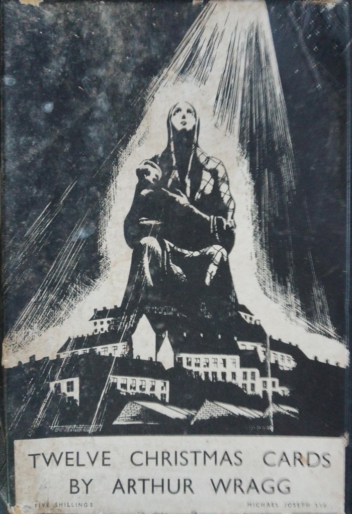
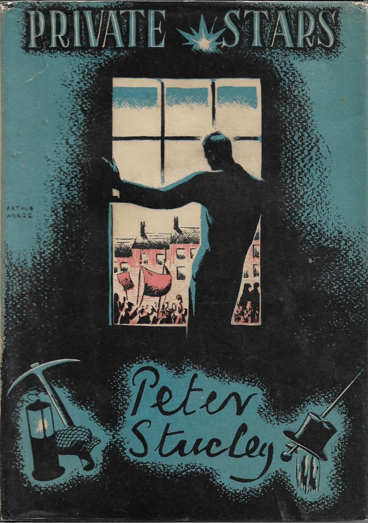
Anyway, on what seems the reasonable assumption that the sketch did relate to the Love on the Dole uses of street-lamps, I can attempt an imaginative reconstruction of what a more complete version of this dust-wrapper might have looked like. I cannot claim much artistic competence, but will bring to bear what I know of Wragg’s processes when drawing book illustrations and dust-wrappers. I was able during three day-long visits to the V&A Archives between 2018 and 2019 to work through the (I think 40) uncatalogued boxes of his papers they hold. These include correspondence, contracts, and a number of in progress illustrations, cartoons, and dust-wrapper designs, both monochrome and colour, with many from the nineteen-thirties and nineteen-forties. I am grateful to the Archivists for making the visits possible and their helpfulness while I was in the reading room (especially in delivering what sometimes seemed an endless though also endlessly fascinating number of Wragg boxes). As far as I could see from illustrations and book covers it was Wragg’s general practice to draw first on thick cartridge paper in pencil and then to go over the lines with a pen and black ink. When he wished, as he often did, to add large areas of dense black he seems to have then used a brush and ink (sometimes repeatedly) to achieve opaque washes. This is his technique for the original drawings for The Lord’s Prayer (published by Jonathan Cape, 1946) and the unpublished Ten Commandments (both in Box AAD/2002/11). These are of course internal illustrations, but a similar approach seems to have been used for the original drawings for some dust-wrapper designs, as in the case of Wragg’s drawing for Mabboth Moseley’s God Created Them Apart (1932?) though here there are also lines finished in red ink (AAD/2002/11: sadly I can find no trace of the published book). This could offer a range of effects, but if you are not familiar with Wragg’s style/s the cover design for the box-lid of his set of Christmas cards for 1935 seems reasonably representative, as does the front cover design for Sixty Years Forward from 1944. For an example of his use of colour I have added Wragg’s published dust-wrapper for Peter Stucley’s novel Private Stars (published by Wragg’s publisher, Selwyn & Blount, London, 1936).

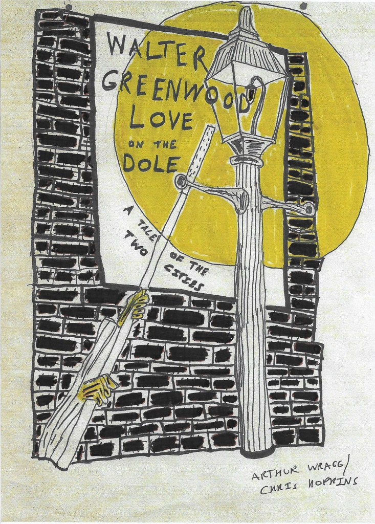
I have therefore adopted (or perhaps I should say adapted) as closely as I can these kinds of technique to give some impression of what this sketch might have become, though I patently lack Wragg’s penmanship and confident line and overall style (and cannot work out how he achieved some effects, especially the fading or ‘dotted’ darkness which he uses round the lettering in the Stucley cover, and quite often elsewhere). The sketch is less abstract than many of Wragg’s designs, but he responded to different briefs in a range of ways. Here then is a stage one speculative completion of the dust-wrapper sketch in terms of pencilled and then inked lines, but still without a book title. I have assumed that new elements were not introduced into the lower register of the page, but that it continued in an austere style with further brickwork and lamp-lighter’s arms only.

As suggested, many Wragg dust-wrappers are monochrome – indeed the majority of those for his own works, suggesting his liking or probably absolute preference for that colour format (as suggested by the title of his The Lord’s Prayer in Black and White, Jonathan Cape, 1946). The monochrome format allowed Wragg to exercise his love of chiaroscuro, which perfectly allowed him to construct his critique of contemporary life as one of outrageous contrast through the use of strong contrasts of light and dark (for an introduction to chiaroscuro see https://en.wikipedia.org/wiki/Chiaroscuro ). This dust-wrapper might then have been a monochrome one; here is my attempt at a completed sketch with the Love on the Dole title added. I have also added the not much used sub-title, ‘A Tale of Two Cities’, partly because otherwise a quite prominent space within the poster area is left blank. One issue with the design is that the lamp-lighter’s pole slightly awkwardly cuts across the space in the circle of lamp-light, leaving a somewhat constricted space for the novel’s title to be placed. I have also added some speculative lines to give the base of the lamp-standard and the arms some hint of termination or beginning. Perhaps the rectangle naming Walter Greenwood and Love on the Dole is a ‘tattered poster’ inspired by the Cape-Manchester stage direction about the street-lamp?
Wragg’s monochrome designs for his own book covers and illustrations frequently used cross-hatching at the least added to the pencil/pen and ink lines, and/or the use in addition of masses of black ink wash in varying proportions. Below is my version of the design above, but with cross-hatching overlaid with a black-ink wash added to the brickwork (I should confess though that while I used a water-based ink and pen for the lines and hatching, I added the ‘wash’ with a broad-tipped lettering-pen, a rather superior kind of felt-tip). If certainly less accomplished, I think it does look something like an Arthur Wragg dust-wrapper design. The overall austerity and darkness relieved with some light / lighter areas does seem suitable for the representation of Hanky Park in the Depression with its odd flashes of enlightenment and humour in an often dark place.

Or perhaps Wragg might have preferred his own version of ‘darkness visible’ by adding some grey shading to the lamp-light, as below? (I used an H pencil here).

Wragg also though did use, as we have seen, a greater colour range in the many dust-wrapper commissions he took on from publishers for other author’s books, and which were clearly important to sustain his income and career as an illustrator / cover designer (though he also mainly took on projects of which he could approve). The image for Greenwood might have been regarded as for a friend or might have been seen as a potential commission. As we have also seen, the use of colour did not in fact restrict Wragg from chiaroscuro effects. So I next tried adding just one further lighter (yellow) colour wash to the ‘illuminated’ areas (again with a lettering-pen), and to the hands of the lamp-lighter (bringer of light, after all). Then I tried a different treatment with brown and yellow. It was comon for dust-wrappers in this period to rely on a colour-palette of only two colours, which together with the background colour of the paper and the use of black lines gave a great variety of effects – and indeed was a limitation leading to the often brilliant and inventive dust-wrapper designs of the time.


Perhaps these colour versions are too bright and optimistic for Hanky Park? (I have another go at a darker version of the yellow/brown washes at the end of the article). The realisations do not, of course, have anything of the quality of a true Arthur Wragg design, but I think give some second-order impression of what this dust-wrapper might have looked like, at least at the mock-up if not the final stage. I have signed them not so much from artistic pride but to avoid any confusion that they are genuine Wragg drawings (NOT that I think there is much chance of that! but who knows in the age of AI?). Below are two further images of actual work in progress by Wragg to suggest that my mock-ups are not complete fantasies. First are two sketches made by Wragg for the dust-wrapper of the same novel – the first at the stage of a pen and ink drawing, the second somewhat different in design but with coloured washes added to the ink drawing.


Finally, here is a detail from one of Wragg’s illustrations to The Cleft Stick (1937) which seems close in subject matter and perhaps some of the treatment. It is the first illustration to the ‘Autobiographical Fragment’, which ends the book and is also titled ‘The Old School’. The piece is about Greenwood’s miserable schooldays but in passing recalls a time when his parents and he had to do a moonlight-flit because they could not pay their rent. This is the left-hand page of the double-page image – the other shows Greenwood’s mother and Walter tagging along behind in the darker portion of the street not reached by moonlight. Here we have not only much brickwork lovingly and beautifully drawn and hatched but also a cinema poster on which only the top word is legible by the light of the moon, if not by lamp-light.

I hope my reconstructions, if not close to authenticity, at least show generic resemblances and related approaches to those hinted at in the original sketch and in the range of Wragg’s practice. This is all perhaps to make much of little, but the process of amateur reconstruction leads me to various reflections. Firstly, if Wragg’s sketch is only a first hint of what might have been, it seems a pity not to preserve it and at least speculate on where it might have led. I think The Cleft Stick as Greenwood and Wragg’s only published collaboration was an important book of the nineteen-thirties in literary, artistic, social and political terms (see Word and Image in Walter Greenwood and Arthur Wragg’s The Cleft Stick (1937) * ). It is a book which really needs to resume its place in thirties reading and to be available to new readers (the very good news here is that Salford University Archives have published a digital facsimile with text and illustrations which is freely accessible – see https://salford.primo.exlibrisgroup.com/discovery/delivery/44SAL_INST:SAL_MAIN/12226189200001611 – click on the upper left-hand book icon to read). So, I am unwilling to simply pass by without comment another if more partial exchange between the two friends and peers. Finally, I had never noticed that the gas-lamps in Love on the Dole were of any importance, but I see now by working through Wragg’s sketch that they play a noticeable part in bringing out a sense of the contrasts of light and dark, hope and disappointment, within Hanky Park. They especially mark at the opening and close of the novel the stasis and circularity of Hanky Park, the likelihood that its people will continue to be trapped in poverty unless there is a change in the fundamental social conditions in which they have to live, or at least relatively radical intervention by the existing bodies politic. In the play and film the street-lamps mark the sense of hope and choices for happy futures which those who live in Hanky Park try to exercise but which are in the end more or less overtaken by oblivion.
I end with a reminder of the original sketch and my last best attempt(s) at a possible completed dust-wrapper, based on my brown/yellow two colour design above but with some amendments, including black ink hatching on each brick instead of brown, reinforcement to the black ink brickwork mortar lines to give the whole a slighter darker and weightier feel, and a different (less awkward?) placing of the book title Love on the Dole. There are, of course, other possible reconstructions (do I actually prefer the stark contrast of cream paper, black ink and black wash and yellow – my very last offering!).


NOTES
Note 1. Michelangelo Capua, Deborah Kerr – A Biography, kindle edition, location 196, originally published in 2010 by McFarland & Co, quoting from Jim Meyer, ‘Deborah Kerr’ in Screen Facts, 1968, p. 6
