
I’m always pleased to buy a book with a well-designed, intriguing and/or visually–pleasing dust-wrapper or cover – whether contemporary or older. The design always gives one possible response to the story within the book – and when you first see or buy the book, this is your first clue about what is within (later you can decide if you agree it ‘captures’ the book). Of course, the cover is a highly-selective introduction to the book, since the artist or illustrator can usually only use one image (or so) to represent the whole narrative, often (though not always) by selecting what she/ he feels is a key scene or moment or an image with metaphorical resonances. For older books, the dust-wrapper or cover does also give the reader / viewer a possible insight (as do newspaper reviews from the time) into how a contemporary – usually a visually-talented one – envisaged this book on behalf of the reading, book-borrowing and book-buying public (and his/her commissioning publisher) . In this article, I would like to explore how illustrators saw Walter Greenwood’s work from the beginning of his writing career until its end. Each of his books and their covers will have a section devoted to it. For some of his books, there were relatively few editions, or, anyway, relatively few different cover designs, while for his first novel at least, Love on the Dole, there have of course been quite a number of different visual (or anyway design) responses, mediating the text for its readers over the years.
Section 1.1: Love on the Dole: Jonathan Cape’s editions, 1933 to 1983

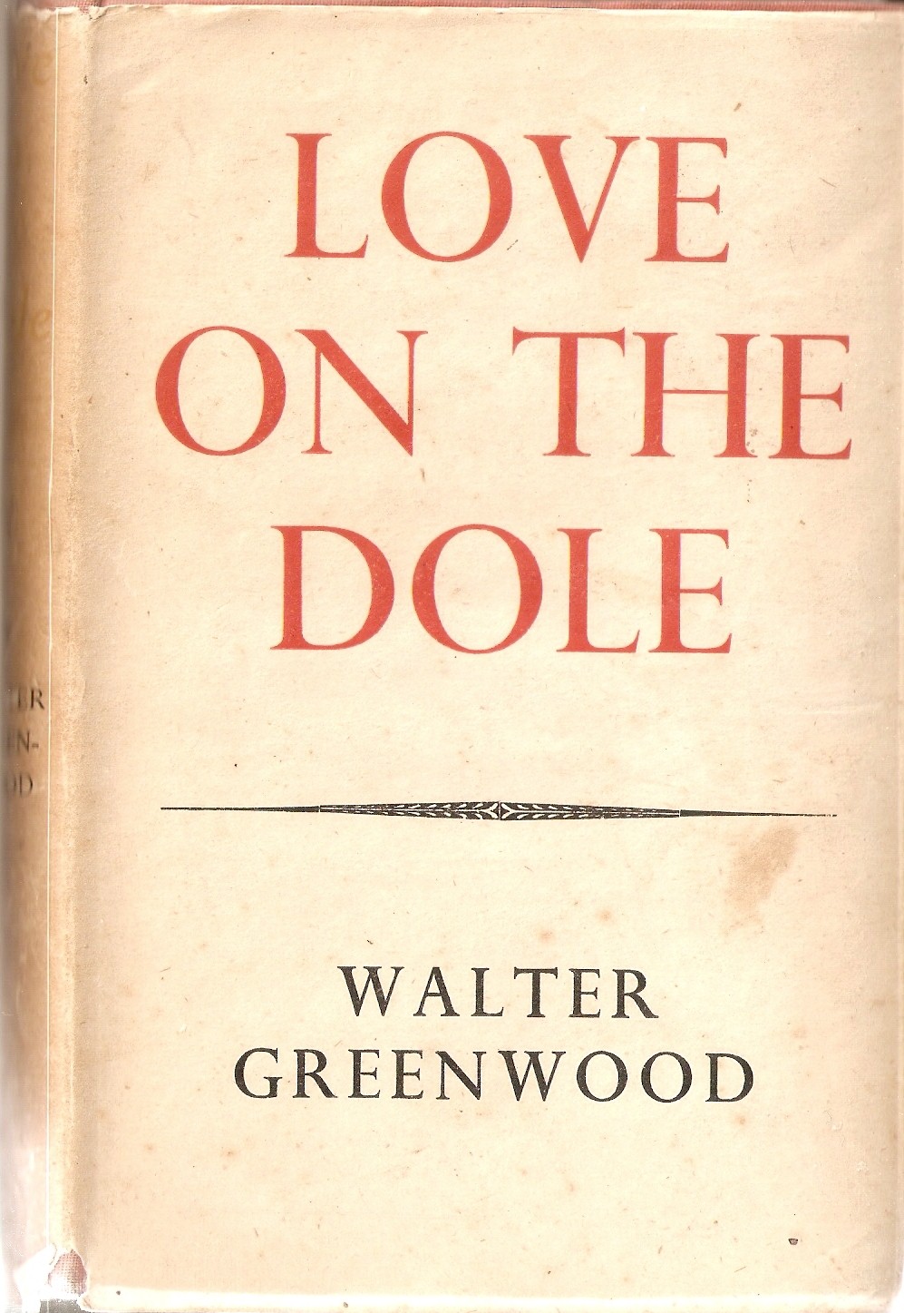
The first dust-wrapper design in 1933 was certainly a striking one – using a restricted colour-range of just black and red against the cream background for both the title text and the images, thus strongly integrating word and image in the design, and giving them a joint impact. The somewhat abstract representation of the chimneys and the works’ buildings (in which they are rendered as an assembly of simple vertical and horizontal geometric shapes rather than with any detail which might disrupt their clean lines) immediately seizes the visual attention. In the upper right-hand space not occupied by the chimneys there is room for the text, ‘Love on the Dole’, with the two most dramatic and meaningful words emphasised in red. This red font is echoed in the sub-title: ‘a Tale of Two Cities’, set into a large red C shape or partly-open circle. This element has always seemed to me the least easily readable part of this design. This is partly because it looks at first as if it is part of the text (a large letter C – and it does echo the upper case C of two cities), but this is not really the case and therefore it must be read rather as part of the cover’s set of images. What though does it represent? I think it may suggest either a magnifying–glass or a section into the works, where we will be able to zoom in on the lives of those who work there. This is the dust wrapper from the 5th impression of the first edition, but is unchanged from that of the first impression (the image is scanned from a copy in the Author’s collection).
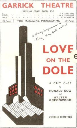
The association of this cover with Greenwood’s novel was strengthened by the fact that a version of it (retaining the chimneys and buildings, but not the red open circle, and adding another higher element to the building, as well as red windows) was also used for the posters and programmes of the London production of the play at the Garrick Theatre, which ran for three-hundred-and –ninety-one performances in 1935-6, and made the reputation of Wendy Hiller , who played Sally Hardcastle.
Though I very much like this cover design it its own right, I have some doubts about how well it does represent the novel’s world – which is surely, during periods of unemployment anyway, more one of left-over nineteenth-century deprivation and slums in Salford, rather than of modernist / art-deco design. Indeed, it might also be added that Greenwood’s writing too is largely unaffected by modernism – preferring a style with considerable continuities with the Victorian novel, if introducing new kinds of content and new working-class voices. However, it may be that the designer was responding to one particular scene in the novel, when the young and naive Harry Hardcastle (desperate to be taken on as an apprentice at Marlowe’s wonderful engineering works) sees the works’ chimneys as indeed a futurist vision: ‘a double row of six smaller chimneys thrust up their steel muzzles like cannon trained on air raiders. Tongues of flame shot up, fiery sprites, kicking their flaming skirts about for a second then diving again as instantly as they appeared’ (p.20, Penguin edition). However, this is not a vision which proves reliable, since apprenticeship completed, he of course joins the dole queue rather then becoming an engineer who is creating a new world.
The designer of the cover has not previously been identified, but is in fact, on strong stylistic grounds among others, J. Z. Atkinson, who designed the dust-wrapper for Greenwood’s next two novels as well – and luckily signed the third design, that for Standing Room Only (1936). Atkinson had also designed some posters for London transport (see poster number 50 here 100 London Underground Posters) and later designed a number of dust-wrappers for Collins Crime Club thrillers, including several by Agatha Christie in the nineteen-forties (see below and also Atkinson Crime covers. Though Atkinson expanded his colour-palette somewhat for these later covers, he always had a preference for a distinctive modernist design (and often for continuing to foreground black text and coloured images against a cream ground). It may be that in his Love on the Dole cover Atkinson is perhaps sustaining his own brand of cover design as much as wholly trying to catch the wider themes of the novel. Few subsequent cover-designers for Love on the Dole achieved such a memorable visual design, but they did perhaps often respond more closely and straightforwardly to the novel’s themes.
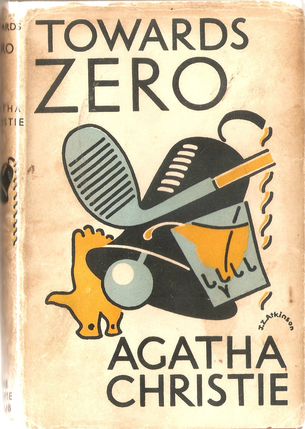
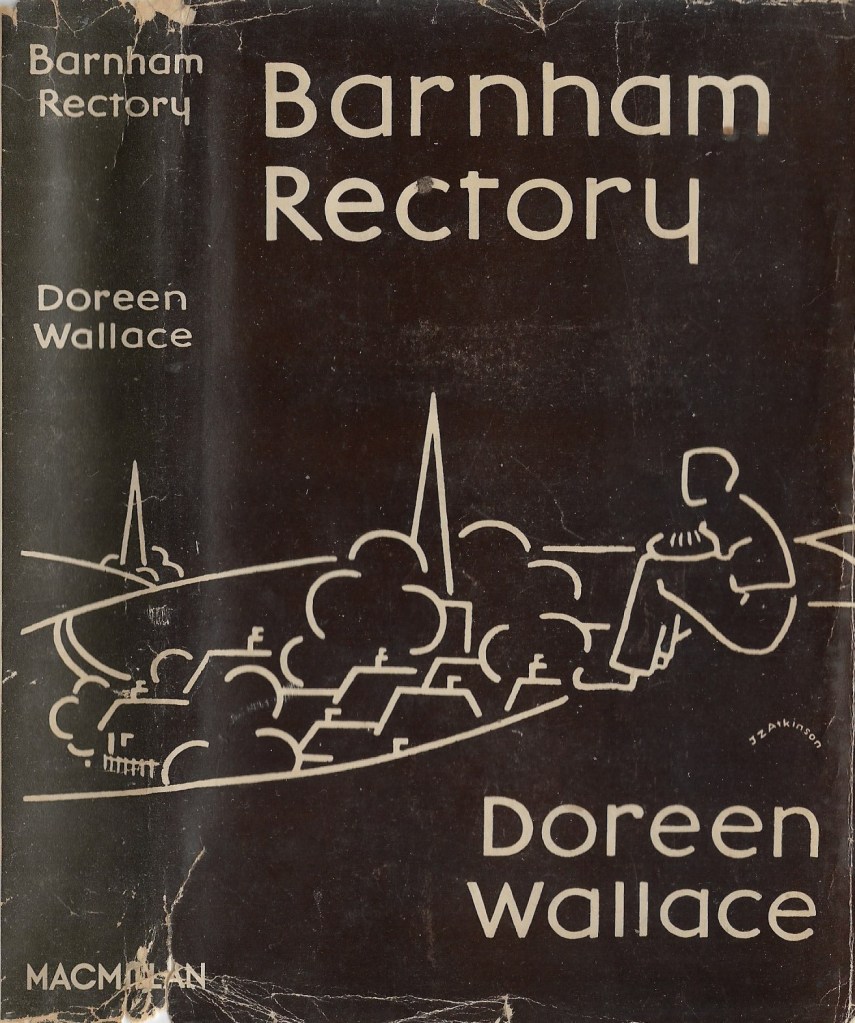
Similarly in his dust-wrapper for a non-crime novel Atkinson showed his love of line and a limited palette, though here he uses a white line against a dark brown sold background to depict schematically a character looking down over a village. This is a US edition of Doreen Wallace’s novel Barnham Rectory (New York: Macmillan, 1935). For an introduction to Doreen Wallace (1879-1989) her life and writing see https://en.wikipedia.org/wiki/Doreen_Wallace. Like Towards Zero and, as we shall see, Standing Room Only, Barnham Rectory has Atkinson’s characteristic but small semi-circular signature.
After the first edition of Love on the Dole and four subsequent impressions with this cover, Cape, realising that they had a best-seller, turned their attention to cheaper editions in their Florin Books series to maximise the readership and sales. The Love on the Dole dust-wrapper for this edition (March 1935 and three more reprints the same year, then two further reprints in 1936 and 1937) therefore lacked any specific individual design, since its Florin series cover signalled value for money and an already famous work, rather then the novel’s themes (which the publisher could now rely on as being widely known). When Cape reprinted the Florin edition in March 1945 they abandoned the Florin series cover and relied on the fame of the title and author name alone on an exceptionally plain cover to sell the book.

Cape kept Greenwood’s novel in print for many years, with further reprintings in 1947 and 1948, a new cheap edition with a new dust-wrapper image in 1956, and a new edition in 1966, reprinted in 1969 and 1973, but they never returned to Atkinson’s cover design (perhaps its visual style spoke too much of the nineteen-thirties – if not necessarily of Greenwood’s nineteen-thirties).
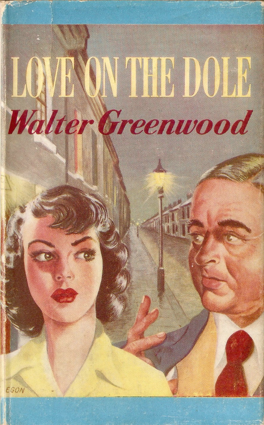
The 1956 dust-wrapper for the small format cheap hardback edition has an interesting design (if one with a markedly popular fiction visual register): the only one which chooses to show Sally Hardcastle not with Larry Meath, but with Sam Grundy the bookie, for he is surely this middle-aged corpulent man with a comb-over wearing a waist-coat and smoking a cigarette while leering at Sally. The background is a street in Hanky Park at night, of course, and perhaps the expression on Sally’s face catches her thinking about the awful choice she has to make which is no real choice: to let her family continue to subsist on inadequate dole payments or to become Sam Grundy’s mistress. The dust-wrapper design is signed ‘Egon’, but I have so far found no other examples of the artist’s work (any information would be welcome). There was also a paperback edition with the same cover-design, in the 2 shilling Guild Books series.
The 1966 edition did have a new (unsigned) and quite imaginative pictorial dust-wrapper, depicting the soles of four very worn shoes (a male and female pair) in light blue against a white background, with wear also indicated by white colouring . These presumably represent both the fruitless tramping round to find a job and the absolute inability to replace worn out garments, as indicators of the novel’s protagonists and this past age’s poverty. The inside of the jacket explains that:
This new re-dressed edition of Love on the Dole has been prepared not only to fulfil a continuing demand from the older generation, but also to appeal to younger readers for whom the dark days of the early thirties in industrial Britain are merely part of textbook history.
Despite this relegation at that time of unemployment to history, the ‘re-dressed’ cover design presumably was partly intended to give the novel a more modern appeal – as no doubt was the choice of a modern font for the title.

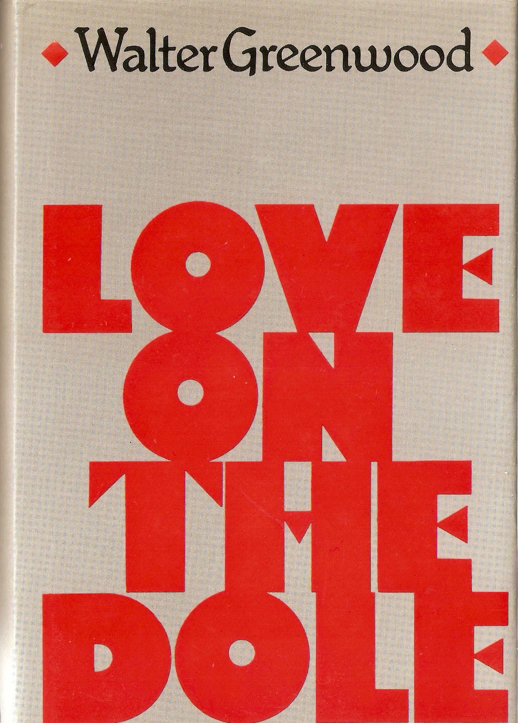
However, the shoes image did not continue to appeal past the seventies, and when Cape printed its fiftieth anniversary hardback edition (also its last edition) in 1983, they relied again solely on the author-name and title (though they kept a version of the 1966 font, though now in red rather than black). The text on the inner flap of the dust-wrapper was, however, updated in line with the recurrence of large- scale employment in British history: ‘Love on the Dole presents a devastating picture of unemployment, as it was in 1933 and with obvious stinging relevance to the situation in Britain today’.
With one early exception, none of the paper- back editions by other publishers felt they could rely on title and author name alone and, as we shall see, they all used pictorial material of one kind or another to attract readers and introduce the novel.
1.2 Paperback Covers of Love on the Dole.
The first paperback edition was produced by Guild Books during the war, in January 1942, and was almost certainly intended to pick up on any renewed interest among readers as a result of the film version released in Britain in June 1941. There is an author’s printed note about the text dated August 1941, but clearly it took a while for the book actually to be published (perhaps because of wartime production conditions?). The non-pictorial cover again indicates the novel’s already established fame and its membership of a cheap edition of quality but best-selling books. As the back cover tells us, Guild books were a set of twelve selected and produced by ‘a large group of British Publishers co-operating with the object of issuing and maintaining a comprehensive list of good books in cheap editions’ (this was no doubt also a venture responding to wartime conditions). Curiously, and of course unlike earlier Penguin paperbacks, this paperback has both the usual printed front paper cover and an identical dust-wrapper which covers it. This seems particularly odd given wartime paper-rationing and shortages.

The longest-lived UK paperback edition of Love on the Dole was first published by Penguin in 1969, and they chose as the cover a detail from a 1919 Labour Party election poster, which featured a dejected-looking but dignified working-class man, and an equally dignified working-class woman dressed in a shawl and looking down affectionately at their baby, with a pit-head distantly visible in the background. The human figures clearly have, and should have, primacy, but the economic primacy of industry, and their exclusion from the wages it at least generates, is implied. The drab brown- grey- black colour-palette underlines the misery of the scene.

The image is from a poster which appears in some websites under the name of the artist Gerald Spencer Pryse (1882-1956), who worked on a number of posters for the Labour party after WW1. The image has the words ‘ Today – Unemployed’ under the two figures, and was in fact originally the second half of a diptych with another image of a British soldier in a trench which bore the matching words at the bottom ‘Yesterday the Trenches’ (I have found no image of the whole poster, nor any very authoritative accounts of Pryse’s career, but see the following web-sites for the two disjoined halves of the poster: https://www.pinterest.co.uk/cgodfree/gerald-spencer-pryse/ and https://www.liveauctioneers.com/item/5343454_321-gerald-spencer-pryse-1881-1957-reproduction-set).
I think this is a nineteen-seventies (?) reproduction of the second poster in the diptych:

Photographed from a copy in the author’s collection – I have not managed to capture the small text at the very bottom, which reads: ‘Published by THE LABOUR PARTY, 33 Eccleston Square, London S.W, and printed by Vincent Brooks Day & Son Ltd 48 Parker Street Kingsway London W.C. 2’. The colour values in this version are distinctly different from those on the Penguin cover – darker and grey and black rather than brown tones, and with a grey-blue rather than pink sky. Still, readers of the Penguin Love on the Dole will have experienced it with that palette.
Though pre-Depression, the image was thus highly suitable in a general way to the themes and politics of Greenwood’s novel, and might also perhaps be interpreted more specifically by the reader as applying to the situation of Harry and Helen, whose child is born into poverty (though the two figures featured seem older than the two characters). The image was in fact used by Penguin in three slightly different covers since Love on the Dole was published first as a Penguin Modern Classic, with the image against a black background, and then in the subsequent redesign of that series with the same image against a white back-ground. Finally, Greenwood’s novel was published as a Twentieth-Century Classic with the image enlarged to fill the whole of the front cover and with the title now super-imposed in white in a box at the bottom (see image above). The Twentieth Century Classics version was kept in print until the 1990s, when it was replaced by the Vintage Books edition of 1993. Gerald Spencer Pryse’s (uncredited) image therefore mediated Love on the Dole for readers for two decades, and in my view did so effectively.
However, there were also two slightly earlier and less long-lived UK paperback editions. The first was published by Four Square Books in 1958, also with a commissioned cover image designed by a British artist, Edward Mortelmans (1915-2008) who signed his cover. Mortelmans drew a large number of striking covers for Four Square Books (as with the case of Pryse, I have found little in conventional authorities about his work, but there is a Flickr group which is seeking to reconstruct his whole oeuvre of books designs – see https://www.flickr.com/groups/1192178@N25/ ). Mortelmans’ illustration shows Sally Hardcastle leading Larry Meath away from the anti-Means Test demonstration after the police have charged the marchers and he has been injured. The image is probably influenced by the 1941 film of Love on the Dole, since it echoes its scene where the mounted police charge into the crowd – which is only mentioned in passing in the novel. The background features a whole landscape of industrial chimneys, but notably smokier and more realistic ones than those of the 1933 dust-wrapper (see above) – and also uniquely adds a gasometer. The decision to place Sally and Larry in the foreground of this scene might suggest to the reader that their romantic relationship (admittedly against a political background) is the key theme of the novel (an interpretation which has worried some critics – see the relevant discussion of the play version in Chapter 2 of my book). It seems to me an image which does grab the reader’s attention and communicates something of what the title Love on the Dole might suggest – but I worry slightly that Larry is clearly walking-wounded, given that in fact his next destination is the Esperance Infirmary – where he quickly dies of his injuries.

The second UK paperback was published by Consul Book in 1965 and again featured a specially painted image – this time unsigned. Again, this image seems influenced by the film version of Love on the Dole. The pictured scene shows Larry and Sally during part of their ramble on the moors with the Labour Party Club (though they have clearly found some solitude at this point). They have escaped from the industrial pollution of Hanky Park – but it is still highly visible, with its smoking chimney and its mill buildings looking like a carefully more realist re-drawing of J.Z. Atkinson’s stylisation of 1933. In fact, this scene does not take place in this way in the novel – Sally gives a general retrospective description to her mother of how much she has enjoyed the ramble, but it is not directly described and nor are Larry and Sally’s thoughts as they look down on what they have temporarily escaped from. However, the play does add this scene and the film follows in this respect, and indeed this image actually echoes the way in which the scene is composed in the film, thus showing a specific interaction between Sally and Larry which does not occur in the novel at all. I still think it is an effective cover – though it may reproduce the Four Square Book edition’s implication that the romance comes first in the novel and the industrial / political background second.

In 1993 Love in the Dole appeared in a new Vintage imprint (established by Random House which by then owned Penguin too) under which the novel has continued in print till the present. However, in that period Vintage have used three different cover designs.

The first was designed by Kelvin Bowers and drew on photography by Niall O’Leary and Michael Wildsmith. The design is clearly based on real (and distressed) objects of wood and metal, though these have been assembled into a whole which is more abstract than literal. I read the wooden elements as furniture or perhaps more specifically a bed (given the castor at the base) and then the rusted wrought iron may also be part of a bedstead, while the metal object in the upper part of the wooden frame looks to be a crudely- designed candle-holder. The background of chipped and dirty green and white tiles may represent a kitchen wall or a floor. This all makes a broad reference to themes in Love on the Dole (the need for ordinary personal lives and feelings, but the poor conditions in which these must take place). The one remaining element in the design is also an ordinary house-hold object, but personalises the more generic objects, and also may make a more specific reference to the story of Hanky Park. This last object is, of course, a photo in a cheap, but slightly fancy frame – and the image of a couple photographed with a cardboard moon might suggest a set-piece holiday photo, capturing the one sea-side holiday away from Hanky Park which Harry Hardcastle and Helen Hawkins take on the winnings from Harry’s successful bet with Sam Grundy (though it may also suggest the single holiday in their lives which Mr and Mrs Hardcastle took as their honey-moon). Holidays (or their lack) are mentioned perhaps surprisingly often in Love on the Dole (some twelve times) so the one more personal house-hold object in the design has rich resonances with the novel.
However, that cover was replaced by one which similarly signalled a bleak environment, but drew also on a different aspect of the novel, and was more minimal.
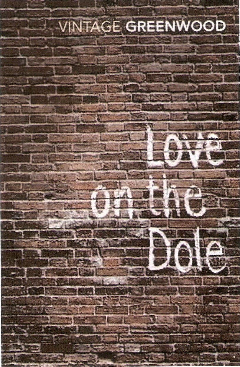
The photograph of a plain brown brick-wall background speaks in a restrained yet eloquent way of the urban uniformity of Hanky Park, and the novel’s title shown as a (rather too well-inscribed?) graffito is appropriate to that deprived world. But the chalked message also picks up Larry Meath’s lunch-break efforts with chalk to explain to his work-mates at Marlowe’s how capital and labour work – and may also imply what the novel itself does, that the words ‘love on the dole’ are also a political message – a clue to how the system reproduces itself by leaving Hanky Park’s people no alternatives. One curious design decision is to omit ‘Walter’ from the author’s name and to instead link author and imprint: ‘Vintage Greenwood’.
This cover was in turn replaced by the current design (the novel now being a ‘Vintage Classic’):

This chooses a more literal design, based on a period photograph of a street like those in which the novel’s characters live (though the blank space above this seems rather purposeless). The photograph shows a street which serves as a communal space, a place to play, live and socialise, and shows lots of children, some women and a number of (unemployed?) men. The novel itself refers to Harry and his mates once they are out of work having no choice (having no money), but to spend all day on street-corners, so the image picks up that motif. However, I worry that the image is a bit too positive for Greenwood’s novel: it shows a positive sense of community – and that has some place in the novel – but it seems a bit light on what were the real miseries of the unemployment which made impossible much of the affordable leisure and community which were to an extent accessible when working-people were in work.
1.3 Overseas Covers
Greenwood’s work was translated at various dates. Love on the Dole appeared in Czech and Hebrew editions in the nineteen-thirties and in a Russian translation, perhaps in the nineteen-forties (my information on this last edition is quite incomplete). The first German translation appeared in 1983. I currently only have images of the Czech and German cover designs, which should certainly take their places here.
The Czech translation of Greenwood’s novel was published in 1937 by dp (Družstevní práce) in Prague (translation by Gerta Schiffová), with a dust-wrapper design by the Czech avant-garde artist Toyen (1902 – 1980: see https://en.wikipedia.org/wiki/Toyen). Since Greenwood was rarely associated with modernism (the first British dust-wrapper of Love on the Dole being a notable exception), this seems an unlikely choice. But while Toyen’s paintings were often highly surrealist, some of her book covers including that for Love on the Dole used the new technique of photomontage in an overall less surreal way (see Art Institute of Chicago virtual exhibition on the Czech Avant-Garde Book: http://www.artic.edu/aic/collections/exhibitions/Ryerson-2014/Czech-Avant-Garde-Book/8) – though surrealism often saw itself as socially as well as artistically radical so there is a match in that respect.
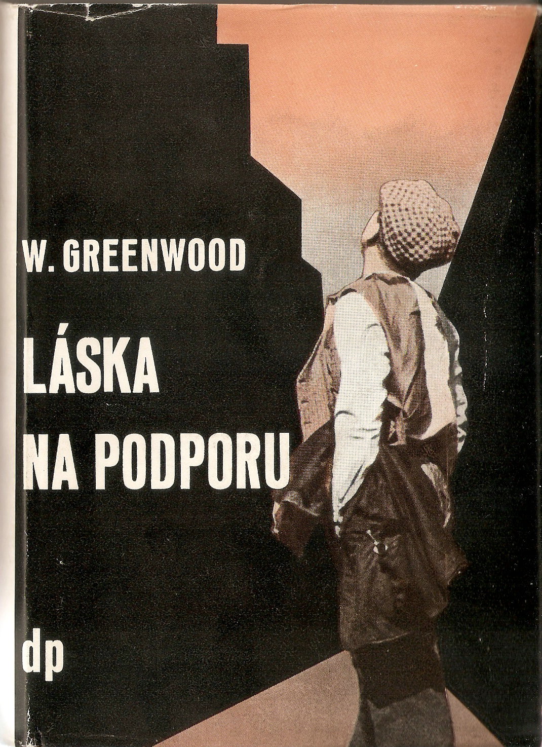
The photographic image of a man is placed slightly to the right-of-centre of the cover, with his cap, waist-coat and short-sleeves (he holds his jacket, perhaps after a hard day’s work) presumably signalling his status as a working-man. His posture is striking as he looks up towards the black mass of the buildings which tower over him and the landscape – the buildings contrast in mode with the photographic realist actuality of the figure, since they are clearly lacking any realist detail and are made up of black cut-outs. The sky and ground are also not photographic, and these contrasts between figure and ground imply his domination by the inhuman and impersonal industrial cityscape. Indeed, the image is positively dystopian, if not quite in the futurist style of Fritz Lang’s Metropolis (1927). The image seems superbly to convey a high-level theme of the novel – the alienation of the working people of Hanky Park by the industrial system, though it perhaps does not capture the idea within the novel that, mainly knowing nothing else, the working people might feel even then content if only that system worked well enough to maintain their lives at pre-Depression levels. See also Don’t Forget to Look Behind the Dust-wrapper! a Hidden Feature in the Czech edition of Love on the Dole (1937) *.
The German edition (translated by Elga Abramowitz in 1983 – Love on the Dole probably had little chance of a German translation in 1933), was published fifty years after the British edition, and made a design choice which one might well have expected from at least one UK edition: it used an L.S. Lowry painting, Coming from the Mill (1930).

This is of course highly appropriate in terms of date and subject and because Lowry is one of Salford’s other celebrated artists (he and Greenwood do not seem to have met, but there is some correspondence in the Walter Greenwood Collection at the University of Salford archives dating to 1960 in which Lowry and his agent reply to a request from Greenwood to use a Lowry painting as part of the scenery design for a play – see item WGC/2/9 at the Walter Greenwood Collection ). This cover design is clearly a quite literal one in that it refers to the work / works which are the key to any prospect of happiness in Hanky Park, and uses Lowry’s depiction of the poorly-dressed and hunched-over workers, male and female, who seem cold, judging form their postures and from the men whose hands are mainly in their pockets (it might seem a prosperous scene were it not for this suggestion that the workers are tired and cold and want to be back at home as soon as they can walk there). It perhaps has some resemblances to Toyen’s cover in showing the human figures dwarfed by the industrial lansdscape, but here that is a communal and collective experience whereas in the Toyen design an individual worker is seen almost cowering beneath the more abstract buildings. The whole painting and some comments of Lowry about it can be see on The Lowry Gallery web-site: Lowry’s Works.
The novel of Love on the Dole was also a considerable success in its US edition in 1934, but I have never seen a copy of this for sale. I have however recently found if not the actual dust-wrapper then at least an image of the drawing on it. The drawing was reproduced with the review of the novel in the New York Review of Literature on August 15, 1934. Like the first British edition the design features works and industrial chimneys, in this case for several works buildings, and adds a water-tower. It is, of course, a less abstract as well as a monochrome treatment. The houses look perhaps more North American than British – indeed they look like timber clapper-board house rather the brick of stone houses one might expect of Lancashire. Perhaps the long line of workers, men and women, most of the latter wearing shawls and some carrying infants, are on their way to join the anti-means Test march? Witnessing the assembling people are two much larger figures in the foreground left of the picture – clearly Larry and Sally, embracing as they watch the spectacle. While the size of these two figures can be partially accounted for by perspective – they are allegedly larger since closer to the viewer – I am not certain this quite works: the transition in scale is too rapid. However, there is no doubt another reason for their size: they are being depicted as of heroic stature, the ‘stars’ of Hanky Park and perhaps working-class leaders. It is a dynamic image full of movement and narrative suggestion, if not certainty. I hope very much one day to see exactly how this drawing was turned into a dust-wrapper with the relation to the three-dimensional book required by that form.

2.1: His Worship the Mayor (1934)
Though much less well-remembered than Love on the Dole, Greenwood’s second novel was in fact also well reviewed and widely read, both in Britain and in its US edition. However, it has not been reprinted since the thirties and had fewer editions, so it follows that there are fewer dust-wrapper and cover designs. I know of only two designs, which are here featured and described. The first British edition by Cape was again designed by J.Z. Atkinson and is more minimalist than his cover for Love on the Dole.

In fact, there is an immediate and literal way of reading the design – it schematically represents the Mayoral chain of office, but beyond that it could not be said that it gives readers, borrowers and buyers any further detail about what they will find in the novel itself. I take it that the yellow band surrounding the title of the novel and the ceremonial title of the Mayor does also deliver a further more metaphorical suggestion about the novel’s interests. It signals the way in which in this narrative a quite ordinary citizen (a struggling draper, Edgar Hargreaves) is elevated (quite undeservedly and for reasons involving the self interests of a corrupt local elite) to a status where he separates himself from the common experience and from in any way helping the ordinary working-people of Salford through his political office.
The US edition of the novel was re-titled The Time is Ripe – a title taken from the main epigraph to Love on the Dole. This was published by Doubleday, Doran & Co in 1935 and adopted a more pictorial and perhaps more immediately readable design.

The tourquoise and brown tones against a cream paper are here used alternately for the author’s name and the title, and then to create two closely-linked yet highly contrasting scenes of life in Salford (and by extension life in Britain). Against a shared sky of white/ tourquoise cloud two streets meet at an angle or corner. The left-hand street is occupied by one large house or hall and by a church – it includes trees in its walled and gated grounds, both behind the buildings and in front of them. In the street are three human figures – two upright men walking down the pavement with confidence, and a top-hatted coachman holding the reins of two horses harnessed to a ceremonial mayoral carriage (he no doubt awaits the arrival of the mayor from within the hall). In the left-hand street are three tumble-down houses with sagging roofs, and washing drying on lines between two of them. There are many more people in this street (I count eleven, plus two a dog and a cat), but in contrast to the inhabitant of the right-hand street they are either bent in posture or (perhaps) in conflict. A stooped older man walks with a sick, while a stooped older woman carries a (heavy?) basket; a presumably younger, but still bent-over, woman pushes a pram (the baby shakes a rattle – even here everyone begins with the capacity for vigour?). Among the younger figures there is also some energy: two boys run along the road together (but they also visually echo the dog chasing the cat, so perhaps they are not that friendly). The scale is small, but the two men in front of the middle house look as if they might be fighting, while the two men further in the foreground look as if they might be exchanging important news (perhaps it is of the closure of the coal-mine in the novel). In some respects there is more life in the poorer street, but the images also suggest that health and other life-chances are unevenly distributed among these close neighbours. Perhaps the water hydrant at the very angle of the two streets represents the public services which should be equally shared by both streets. The design is signed ‘Haberstock’, indicating that this is the work of Robert B. Haberstock, who designed a number of striking dust-wrappers from the thirties onto the fifties (including for Emma Gelders Sterne’s Some Plant Olive Trees, Dodds, Mead and Company, New York, 1937 and Robert Wilders’ The Wine of Youth, Putnam, New York, 1950). I feel this design catches nicely some of the concerns of Greenwood’s second novel.
There was a further UK edition, but it relied for impact on Greenwood’s name and inclusion in a ‘good value’ series. This was the Jonathan Cape paperback ‘Pocket Book’ collection, which reprinted His Worship the Mayor in 1940.

3. Standing Room Only (1936)
The first Cape edition of Standing Room Only was the third for a Greenwood novel by J.Z. Atkinson (though the first he signed). The novel (echoing aspects of Greenwood’s own career) is about a working-class man from Salford, whose first play becomes a hit.

On the front the dust-wrapper shows in Atkinson’s characteristic outline style (with thick black lines and minimal colour against a cream background) the audience for the play. These audience members seems to be from their hats and other minimal features a younger woman (with a hand-bag), an older women with an umbrella, and perhaps a working-man with his cloth cap, and cigarette in hand. They might represent the broad audience which, indeed, Greenwood, may well have been aiming at in his writing. Meanwhile, significantly and creatively placed on the spine of the dust-wrapper, is the working-class author hiding in the wings nervously smoking a cigar and newly translated into top-hat and tails.
The only other (more or less) pictorial dust-wrapper for Standing Room Only was that for the US edition published also in 1936 by Doubleday Doran. It chose to make the title text itself act as a teasingly semi-pictorial evocation of the theatrical setting and themes of the novel.

Thus the white-font title divided by the line between the solid brown / red backgrounds may perhaps suggest either the actors on the stage and the audience in the auditorium, or those standing at the very back of the auditorium behind their seated companions. Either way, the wrapper subtly suggests the focus of the novel on the world of theatrical success. The text on the front end-paper says that in this novel, ‘you will find Walter Greenwood … in a less scorching mood than in his earlier books, but in a satire which, if it is more amiable, is none the less moving and memorable’.
There was a reprinting of Standing Room Only by Howard Baker (London) in 1970. This made attractive and more obvious reference to the novel’s theatrical themes by rendering the entire dust-wrapper as the typical heavy red velvet curtain of a British proscenium-arch theatre, complete with golden fringes (the novel’s sub-title in its border recalls the projection of adverts on to a screen on the curtain at the interval).
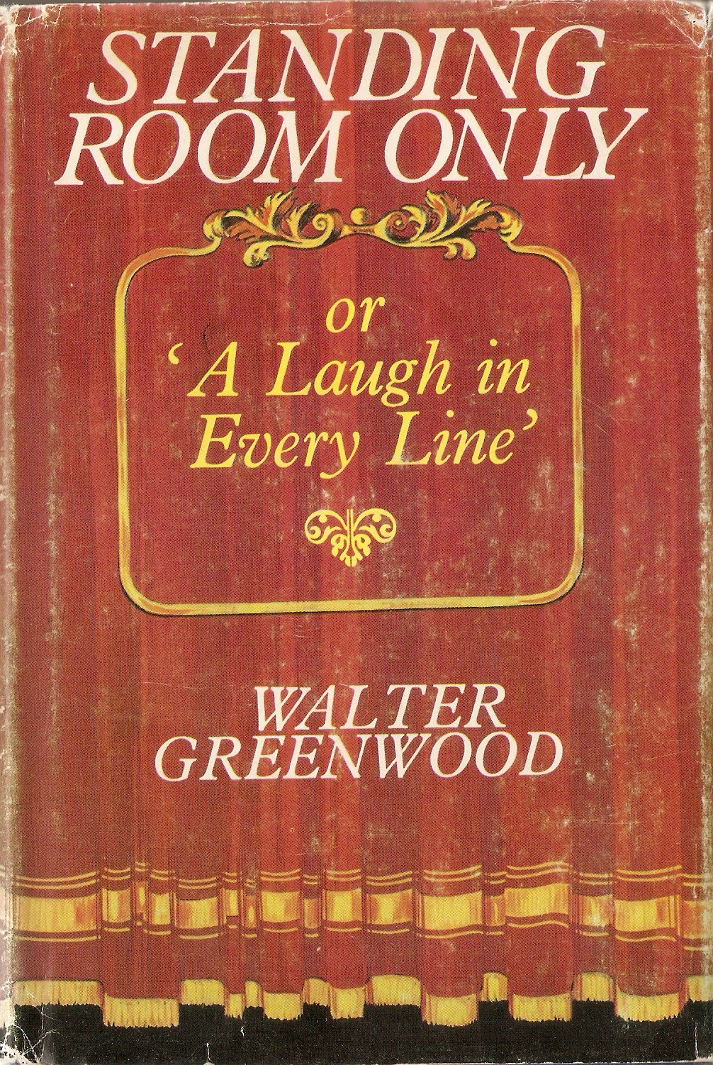
If the reader goes behind that curtain by opening the novel, they will no doubt find out much about what goes on back-stage and behind the scenes in the production of a play.
4. The Secret Kingdom (1938)
Greenwood’s fourth novel was published with an exceptionally plain cover, relying solely on the established fame of the author’s name, since the novel’s title is far from immediately informative.

However, there was a 1949 reprint by Hutchinson with a more interesting dust-wrapper.

This unsigned cover is somewhat Lowryesque in its naivity and in the depiction of a Salford neighbourhood. The figures are somewhat hemmed in and dwarfed (as in some of the Love on the Dole covers)by the the grey stone buildings, which completely fill the background of the picture-space – indeed it seems possible that the leaning pub, the Palatine Arms, may topple over on them at any minute. However, the colourful clothes of the figures and their willingness to lead their social lives in the public space of the street suggests a resilience and a sense of community too (something which is very appropriate to the interests of novel). The dashing figure in white, twirling his mustaches, is the novel’s main male character in its early stages – Robert Treville, who feels that frequent visits to the nearby Palatine Arms, are bound to ensure a regular flow of customers to his barber’s shop. He was based on Walter’s father, and like him, dies young. The novel begins two decades before the depression, but presumably the male figure sitting on the pavement is nevertheless only there because he cannot afford the price of a drink and a seat inside the pub (the boy too seems to be appealing fruitlessly to the standing man for money). Women outnumber men in the scene, but seem to fall into two distinct generations: the older women wear the traditional clogs and shawls of Lancashire, while the three younger women at the left mid-point wear a newer mode of mass-produced but not necessarily more-enduring hats, coats, stockings and shoes (we see something of such a contrast in the costuming of women in the 1941 film, too). The three younger women are presumably the novel’s three Byron sisters, one of whom, Paula, marries Robert (in fact she is much more the novel’s central figure then he is). This is surely a poor community, but at the beginning of the twentieth century, it looks in this depiction anyway, less hopeless and more tolerable than the desperate world of Hanky Park in the nineteen thirties.
I have only ever seen one copy of this edition, which is of interest not only because of a highly appropriate dust-wrapper, but also because it is the only Greenwood novel which both of his publishers printed. He was a Cape author for his early work and then transferred to Hutchinson – but this edition is the only case where Hutchinson acquired an earlier Cape novel, presumably seeing it as still having appeal for their post-war readers.
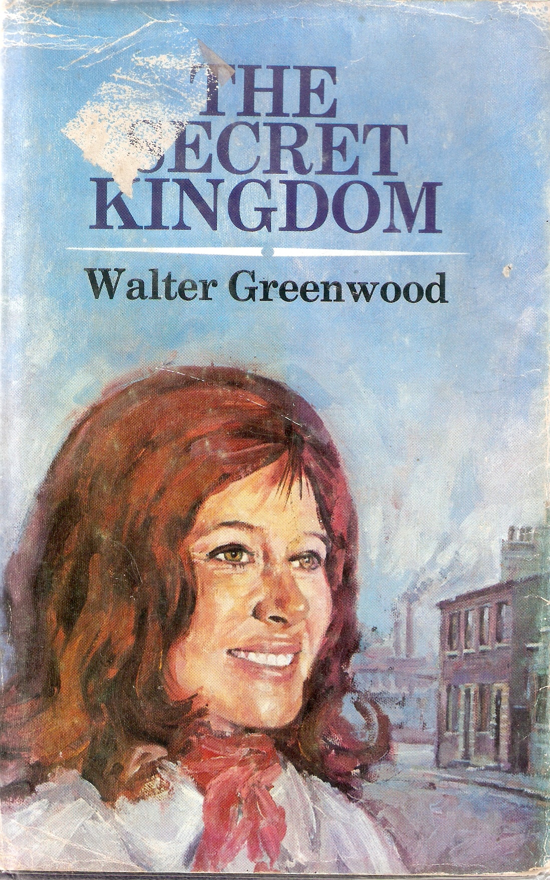
Morley-Baker published a new hardback edition of The Secret Kingdom in 1970 with an illustrated dust-wrapper, which is dominated by the novel’s central character, Paula Treville (nee Byron). Her hair-style looks more nineteen-seventies than nineteen-thirties (as do her white blouse and red scarf), but the nineteenth-century terraces of Hanky Park and in the distance the smoking chimneys of Marlowe’s works are still there. Paula’s abstracted and happy facial expression suggest the inner strength which her rich ‘secret kingdom’ (the world of books, music and political belief) give her in the outwardly poor and drab work of nineteen-thirties Salford. The cover-design is attributed on the inner fold of the dust-wrapper to Ken Freeman, who designed at least one other cover for Howard-Baker book and also for Consul books during the nineteen-seventies. This individual, ‘inner’ representation of the novel’s main theme contrasts markedly with the Hutchinson 1949 cover, which emphasised rather the communal life of Hanky Park. There is some true reflection of the novel in both designs.
5. Only Mugs Work (1938) – a missing dust-wrapper.
IN FACT, I have now filled this gap – see Walter Greenwood: The Missing Dust-Wrapper – NOW FOUND!
Greenwood (for the first time) published two novels in 1938, The Secret Kingdom for Cape and a thriller for Hutchinson: Only Mugs Work – a Soho Melodrama. Sadly, I have never seen a copy of the thriller with its dust-wrapper and so have no idea of its design (I would welcome information if anyone has any). However, unusually Only Mugs Work did have some visual material on its frontispiece which I can at least share.

This may well be a collage based on real newspapers and clearly suggests that even if the novel admits it is a melodrama, current reality is just as lurid (indeed one of the featured articles puts this verbally as well: NOT FICTION, BUT FACT’).
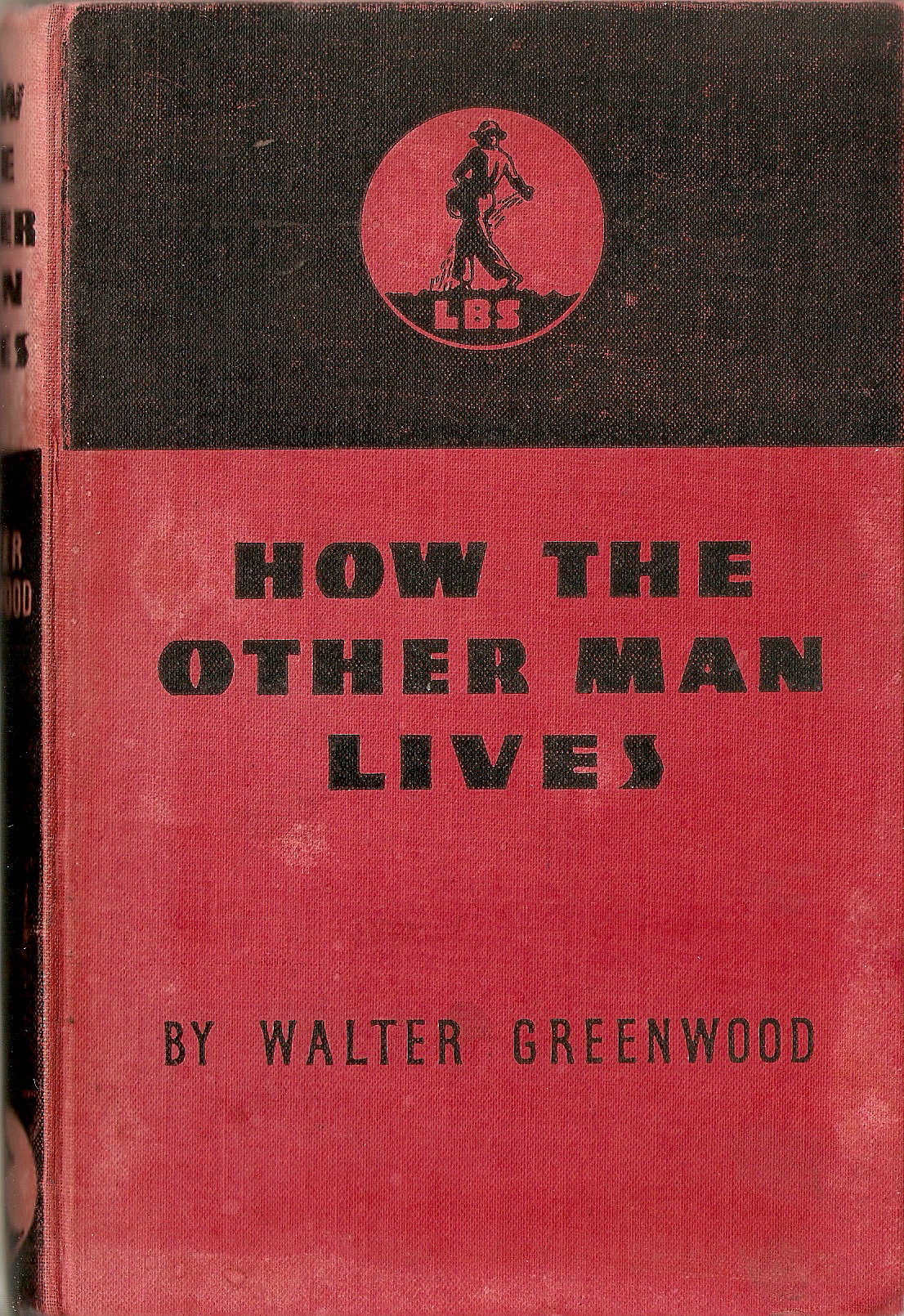
6. How the Other Man Lives (1940)
Love on the Dole was quite often referred to as a ‘documentary’, but I am not convinced that its techniques are particularly documentary, and nor are those of Greenwood’s other novels. But one work which he wrote is much more documentary in its approach, being based on thirty-seven interviews with a range of workers about their jobs and reporting their sense of their own experience: How the Other Man Lives. This was published by the Labour Book Service in a generic cover which emphasised the publisher over the individual author. It is a work well worth reading, both for its sympathetic and detailed portrayal of the experience of work for many kinds of workers in the thirties, as well as for some autobiographical reflections on different kinds of work by Greenwood himself. The title’s masculinist bias is reflected in the gender of the interviewees and the range of occupations, but there are a number of reports from female workers too.
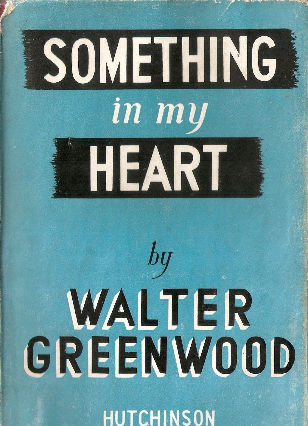
7. Something in My Heart (1944).
Greenwood’s fifth novel – his only wartime piece of fiction – has been strangely forgotten, given that it is a sequel to Love on the Dole that explores the roles of the unemployed people in Salford once war breaks out and they at last have the opportunity to work again (two of the young men join the RAF and find they are just as able and useful as people from much more privileged class-backgrounds). The novel strongly makes the point that government inactivity and apparent social indifference in peace-time can be rapidly transformed into a relatively efficient planned economy once war threatens national survival. The novel was positively reviewed by a wide range of newspapers and widely read (for a longer account of the novel see my essay ‘The Army of the Unemployed: Walter Greenwood’s Wartime Novel and the Reconstruction of Britain’, Keywords – A Journal of Cultural Materialism, Vol.10, October 2012 ). The cover of the Hutchinson first edition is not very striking, and I have to confess that I don’t (so far) understand the minimal pictorial implications which are there – does the white lettering against the background black brush marks evoke something like a wartime stencil in the blackout? (any ideas would be welcome).
Much more eye-catching was the Hutchinson 1945 reprint which had a pictorial rather then solely typographic dust-wrapper. It depicts the three protagonists at the opening of the story – Harry Watson in the centre, Taffy Lloyd to his left, and Helen Oakroyd looking at the two men from their right. these are the streets of Hanky Park in the late thirties, and little has changed since Love on the Dole days. Harry and Taffy are long-term unemployed, hence their dejected looks, though Helen has a job in a mill. The blood-red sun in almost the dead-centre of the wrapper seems ominous and mysterious and invites a metaphorical reading. Night may literally be just about to fall, marking the end of another day spent wandering the streets, but does it also suggest the the looming war is the only way out of the Depression?

The title of the novel is itself not very revealing about its contents (and having read it, one still has to guess at the implications – which are I suppose that it is the human experiences before and during the war which really matter more than the war-machine itself). Harry and Taffy do escape their miserable worklessness by joining the RAF – now the Government having left them to rot for most of a decade suddenly has a use for them. The Morley-Baker (Leeds and London) reprint of 1969 perhaps chooses a more pictorial dust-wrapper design precisely to off-set the vagueness of the title, and shows not the beginning of the narrative in Salford, but Harry and Taffy’s wartime contribution to Britain.

The more sharply depicted Spitfires may suggest the real external events which the novel covers, while the contemplative and more impressionistic pilot on the ground may imply the internal histories and experiences, thoughts and feelings which should be taken most note of. At the very least, this cover gave a firm clue about the focus of the novel.
There was also a translation into French made available soon after D-Day, under the title Mais Aussi les Hommes (1944, Editions Corea, Paris). This is not much more specific than the original title, but I slightly prefer it – the implication again presumably being that it is the human element that matters most. The cover- design itself is merely that of a series, however.
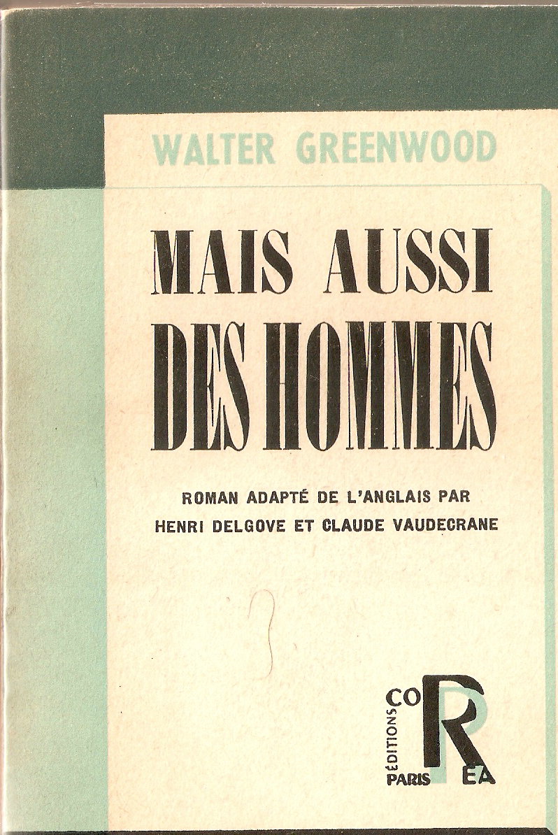
Greenwood’s original English edition had six epigraphs, quite a few of which cast some doubt on whether the British government (especially under Churchill) would honour wartime promises of radical social reform. Interestingly, these all disappear from the French edition and are replaced with one famous quotation from Churchill himself, implying much greater trust in him: ‘jamais, dans l’histoire des conflits humains, une dette si grande n’a été un si petit nombre’. Of interest too, is the topical introduction of a dedication to the French airman, St Exupéry, who went missing while on a reconnaissance flight with Free French forces in North Africa in July 1944.
RECENT ADDITION. I had always assumed that since this Correa edition had a soft cover it did not have a dust-wrapper. However, recently (February 2022) a single copy of an edition has come on the market with a striking illustrated dust-wrapper (it is dated 1946 rather than 1944, and the Churchill quotation has been removed, so perhaps the dust-wrapper was added only for this later edition?).
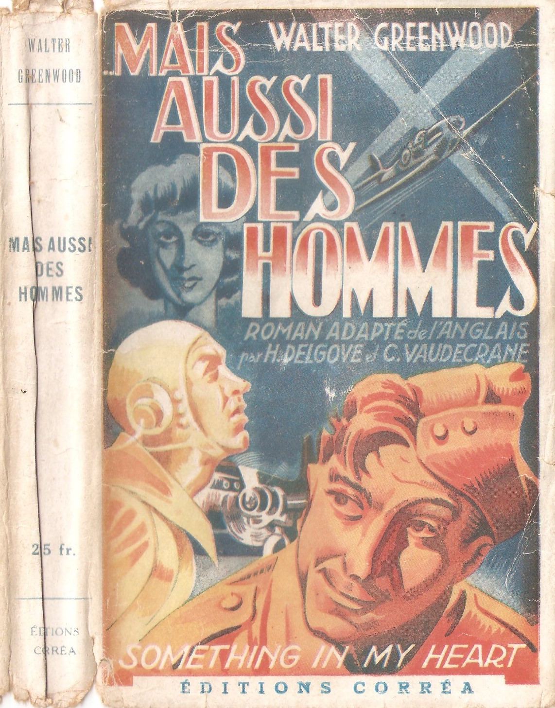
Like the 1945 Morley-Baker reprint, the illustration focuses on the Salford men’s RAF career, though it does at least also include Helen (whose domain nevertheless seems to be in the background blue of the night-sky in which she is a passive or monumental figure), and Taffy. The whole design has many (stereotypically masculine) elements that are dynamic, with the viewer’s gaze perhaps first drawn by the animated postures of the two airmen in the foregrounded orange/yellow tones, which are also picked up by the colour in the title lettering. Harry is the leader in the novel which is reflected by his dominance in this image, with his thoughtful and even amused face contrasting with Taffy’s more apprehensive skyward gaze focusing on the Spitfire beneath the searchlights – and also on the words of the title which appear too to be projected on the night-sky. In the novel, the two men serve first in Fighter Command and then in Bomber Command, which may be reflected by the fighter above and the twin-engined plane on the ground.
8. Lancashire in the County Books Series ( 1951)
This series published by Robert Hale was made up of fifty-seven volumes covering each of the counties of Britain (more or less – London was covered by six volumes and all of Scotland by two volumes, one on the lowlands and one on the highlands). Greenwood’s covered the county of his birth, which he says in the first chapter is ‘the keystone of our country’s economy’ and heavily associated with industry:
There is a tang about the name [of Lancashire]. It conjures at once a picture of mills, factories, foundries, pits, dinning roads, railway yards, canals and ports breathing smoke, fire and noise and all producing what? The wealth our country must export in order that all in these islands may eat (p.1).
Given this stress on industry (which the whole volume sustains, though the countryside is discussed as well), the dust-wrapper design seems surprising.

In the background there are four industrial chimneys, incidentally recalling the first dust-wrapper design of Love on the Dole, but the design is dominated in the foreground by the coastal theme of beach, sea, boat and lighthouse, and in the middle ground by hill and tree (the design is signed, but the signature is difficult to read even with a magnifying glass – I’m unsure whether it says C. Belling or Beeling or Beezing or Beeline – but anyway have so far found no trace of any of these names). Sad to say, every volume in the series has this same illustration, thus losing an opportunity to differentiate the differing counties of Britain, and reflect the individual emphasis of each volume and author. Nevertheless, it is a satisfying cover, and (again incidentally) echoes with the settings and cover-designs of The Trelooe Trilogy which Greenwood was working on in the early fifties.
9. The Trelooe Trilogy (1952, 1954, 1956)
It was another eight years before Greenwood published another novel (though he had been busy with theatrical projects). Between 1952 and 1956 he completed his Trelooe Trilogy for Hutchinson, made up of So Brief the Spring (1952), What Everybody Wants (1954), and Down by the Sea (1956). The trilogy was set in Cornwall, where Greenwood had holidayed since meeting his artistic collaborator Arthur Wragg in the 1930s, and where he was then living. All three dust-wrappers offer a degree of romance and sea-side excitement and share something of the same flavour (some reviews suggested they were ideal holiday reading). The first two (which are both unsigned) seem closer in style than the third, but each is attractive and appropriate to their novel, and all combine clearly visible pen and ink lines and sketching with colour infills.

The dust-wrapper of the first novel shows the two characters who do indeed appear at first to be the main romantic leads (though it does not quite work out like that). Ann Halstead is, as her costume suggests, enjoying a liberating holiday from London – a holiday partly taken to decide whether to marry her dull suburban fiance or not. While in Trelooe, she certainly finds the local fisherman, Randy Jollifer, of interest (though equally Cornwall itself, and Randy’s partial claim to a semi-ruined manor seem to have some additional power over her feelings). This sounds a long way from the world of Love on the Dole, but actually picks up on the inevitably disappointed pastoral-seaside dreams of Harry and Helen and develops them further. The cover’s suggestion of an emotional story foregrounded against a natural and beautiful place is certainly accurate, but Greenwood’s writing has not here become entirely sentimental – there is much too about the difficulties of the fishermen’s lives, and about the lives of rich and poor after the social reforms of 1945. Ann looks like initially as if she will be another Sally Hardcastle with a freer choice, but in fact is tempted to choose inherited wealth over the working-man.
What Everybody Wants (1954) and Down by the Sea (1956) both continue in the same setting and with Randy Jollifer as an important and contented character, but he is displaced from the centre of the narrative by a much more disturbed character, Darky Durrant (Greenwood’s names both seem unfortunate here in hindsight). He is a tough character on the margin of Trelooe society, (probably seriously damaged and isolated by his wartime combat experience). He is what the novel terms a ‘gypsy’ and is also a poacher, though with a distinguished war record (naturally of a slightly irregular kind: he carried out raids behind the lines as a Commando). He lives in a semi-ruinous cottage and lives hand to mouth – a number of the characters and clearly the novel itself admire his close relationship to the natural world despite his disregard for many property laws. When it comes to real moral questions, Durrant always makes the right choices, unlike some rich and on the face of it respectable characters. In What Everybody Wants he marries a capable orphaned servant girl, who during the course of the final novel, Down by the Sea, brings him to an extent back into contact with society and the legitimate economy, by opening his cottage as a tea-room for tourists.

This cover suggests both the seaside setting and the novel’s pleasurable offering to the reader of access to personal and romantic lives.

The cover of the final novel of the trilogy again suggests the liberating and potentially romantic possibilities of a holiday. The review which suggested these novels were ideal holiday reading was perhaps making an acute point about some of the reading pleasures they offered.
10. Saturday Night at the Crown (1959).
This was Greenwood’s last novel (though not his last book). It is set almost entirely in a pub over the course of one day / night. It is interested in working-class life in this new post-war and more affluent world. All is far from perfect, but while some characters are motivated by greed and selfishness, others reflect on improvements in life since the nineteen-thirties and especially since 1945 and the founding of the welfare state.

The dust-wrapper design is a little Lowryesque, with its colourful ensemble of characters in a naive style. The illustration is signed by Douglas Hall, who worked on a a number of book designs between the late nineteen- fifties and seventies, including Puffin children’s books such as Diana Francis Bell’s The Rebels from Journey’s End (1969) and a number of editions of the Hebridean novels of Lilian Beckwith (for example, The Sea for Breakfast, 1961). The seated figure in green is Ada Thorpe (originally acted in the stage version by Thora Hird) and the glum man sitting next to her is her somewhat dominated husband – who speaks only once at the very end of the novel.
11. There Was a Time, 1967.
There Was a Time is Greenwood’s memoir, though some of the few critics who have referred to it think that it is highly novelistic. In fact, keen as I am on Greenwood’s fiction, I think that There Was a Time is one of his best pieces of writing, and perhaps the best in some ways. It was his last published prose work and was written after more than thirty years experience of being a professional writer. There Was a Time revisits the setting and circumstances of Love on the Dole in its own autobiographical way from the perspective of the nineteen-sixties.
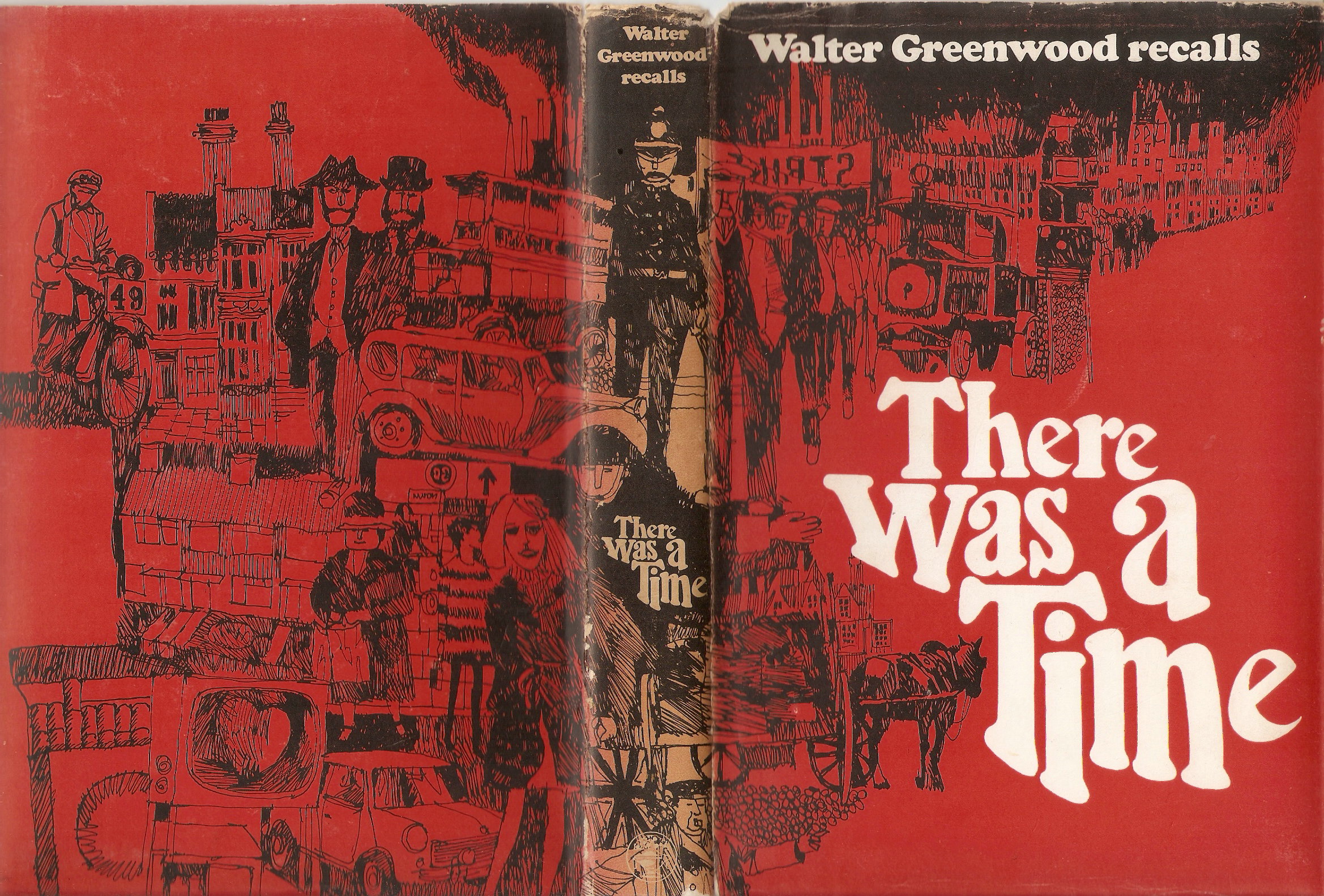
Jonathan Cape published the memoir in hardback in a striking dust-wrapper with a red /black / white design by Leigh Taylor, who worked on a number of Cape books from the sixties until at least the nineteen-seventies. The cover portrays the periods covered by the book, starting with the nineteenth-century on the upper rear cover and then moving round the spine to scenes from the nineteen-thirteen before moving back round to the lower rear cover, which depicts the nineteen-sixties (though not everything is quite in sequence of period). At top left are the nineteenth-century mansions which originally dominated Hanky Park (as referred to in the opening pages of Love on the Dole), with two of their owners depicted in front of them, and below them some humbler houses – but with front gardens so perhaps decent sixties housing rather than back-to backs? Next and behind them to the right is a motor bus, an element in the design’s consistent interest in changing modes of transport – chiming with the back view of a tram on its rails to the right, with a horse and cart in the lower right, a traction engine in the upper right, a thirties passenger car (perhaps containing chauffeur and well-off passenger), a thirties motor-bike in the upper left (is it a TT racer, picking up Greenwood’s script for the George Formby film, No Limit, in 1935?), and finally the sixties icon, a Mini, in the lower left, a car now affordable to many more people than the saloon above it . The mansions equally form a part of the pattern of buildings on the cover, which include two sets of factory chimneys, of which one set to the right particularly resemble those on the first edition of Love on the Dole. There is also a people theme taking in the mansion-owners; to their left and dominating the book’s spine are three authority figures – an Edwardian police constable on his beat (before cars?), a wartime policeman in tin hat directing traffic, and then a figure at the very bottom who is also directing traffic, but whose uniform I do not recognise. To the left of these figures are working-men with a strike banner – and we are presumably now in the twenties or thirties again. On the lower left are three female figures. Two are clearly fashionably dressed and perhaps liberated women from the sixties (we could make an association with the heart image on the TV), while the third is an older women, perhaps to be read as representing the thirties or the older generation who are in now in a better place in post-war Britain (however, no sixties men are represented) . Finally, there is the title dominating the lower right of the design, with a contemporary (sixties) font, standing out in bold white against the red background and black line-drawings . The activity of the cover and its portrayal of change seems well-suited to the interests of Greenwood’s memoir and its central belief that there have been social improvements (though perhaps with some loss of the neighbourliness and close community which it shows as the only defence against hardship). Penguin printed a paper-back version in 1969 (with the same cover design), which sold well.
