
In 1937 Greenwood’s novel was translated into Czech by Gerta Schiffová and published in Prague under the title Láska Na Podporu by the publisher Družstevní prace (though strictly speaking the full title while not shown on the dust-wrapper also included the sub-title of the original – a Tale of the Two Cities: pohádka dvou měst). The dust-wrapper was designed by a well-known Czech surrealist artist known as Toyen (1902-1980, known in pre-artistic times as Marie Čermínová), who was also well-known for their work on books, including some five hundred illustrated books and/or dust-wrappers.
Indeed the Czech edition had a distinguished production team and also drew appropriately on several collective and presumably radical or socialist organisations. The edition has what may have been a general feature in Czech books of the period or may have been a sign of the book’s high production standards: an extremely informative table of exact contributions:
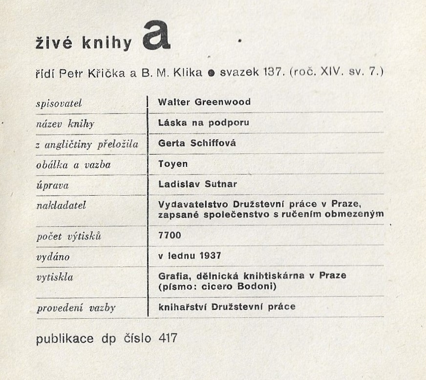
With the kind help of Pavel Drábek, Emeritus Professor of Drama and Theatre Practice at the University of Hull, I have been able to derive the full benefit of the table through his complete translation:
živé knihy [live books – series title]
series editors Petr Křička and B. M. Klika, vol. 137 (year XIV, vol. 7)
writer Walter Greenwood
book title Láska na podporu
translated from English by Gerta Schiffová
book cover and binding by Toyen [i.e., Marie Čermínová]
book design Ladislav Sutnar
publisher: The Collective Works in Prague Publishing House, a registered collective with limited liability
the run: 7,700 [copies]
published in January 1937
printed by Grafia, the workers’ bookprinters in Prague (typeset: cicero Bodoni)
bookbinding by The Collective Works Bookbinders
Publication of DP [The Collective Works] no. 417
Presumably the ‘Collective Works’, ‘the Collective Works bookbinders’, and the ‘workers’ bookprinters’ were happy to work on Greenwood’s novel having identified it as a highly sympathetic contribution to the representation of the condition of workers during the Depression. I think this information also makes clear that Toyen was indeed the artist for both the dust-wrapper and the inner design (‘book cover and binding’), though I also note the credit for the overall book design given to another distinguished Czech designer, Ladislav Sutnar who also pioneered the use of photomontage on dust-wrappers (for an introduction to his life and work and examples of his photomontage dust-wrappers see his wikipedia and especially Chicago Institute of Art entries: https://en.wikipedia.org/wiki/Ladislav_Sutnar; https://www.artic.edu/artists/25278/ladislav-sutnar).
The Chicago Institute of Art also records in a digital display a fine exhibition at the Ryerson & Burnham Libraries in 2014 on ‘The Czech Avantgarde Book’ in which Toyen’s work featured. This included the dust-wrapper from Love on the Dole as well as three other works, one in translation, two in Czech: Andre Breton’s Les Vases Communicants, 1934, Bohuslav Brouk’s Marriage: Sanatorium for the Inferior, 1937 and T. Svatopluk’s Gordon’s Trust Sues, 1940. The first two designs are suitably surreal in style, while the last has more similarity to the Love on the Dole dust-wrapper in using photomontage to produce a part realist-part metaphoric image of the worker in an oppressive industrial environment (all the dust-wrappers and their Czech titles and bibliographic details are shown at: https://archive.artic.edu/ryerson-2014/czech-avant-garde-book/8). Here is the Love on the Dole dust-wrapper with its use of photomontage:

In 2018 I wrote about the Láska Na Podporu dust-wrapper in my early (and long!) article on all Greenwood’s covers and dust-wrappers from 1933 to the present (https://waltergreenwoodnotjustloveonthedole.com/longer-articles-2/). This is what I wrote (I have cut a few sentences which would simply repeat material from the above introduction):
Greenwood’s work was translated at various dates. Love on the Dole appeared in Czech and Hebrew editions in the nineteen-thirties and in a Russian translation, perhaps in the nineteen-forties (my information on this last edition is quite incomplete). The first German translation appeared in 1983. I currently only have images of the Czech and German cover designs, which should certainly take their places here.
The Czech translation of Greenwood’s novel was published in 1937 . . . with a dust-wrapper design by the Czech avant-garde artist Toyen . . . Since Greenwood was rarely associated with modernism (the first British dust-wrapper of Love on the Dole being a notable exception), this seems an unlikely choice. But while Toyen’s paintings were often highly surrealist, some of her book covers including that for Love on the Dole used the new technique of photomontage in an overall less surreal way . . . though surrealism often saw itself as socially as well as artistically radical so there is a match in that respect.
The photographic image of a man is placed slightly to the right-of-centre of the cover, with his cap, waist-coat and short-sleeves (he holds his jacket, perhaps after a hard day’s work) presumably signalling his status as a working-man. His posture is striking as he looks up towards the black mass of the buildings which tower over him and the landscape – the buildings contrast in mode with the photographic realist actuality of the figure, since they are clearly lacking any realist detail and are made up of black cut-outs. The sky and ground are also not photographic, and these contrasts between figure and ground imply his domination by the inhuman and impersonal industrial cityscape. Indeed, the image is positively dystopian, if not quite in the futurist style of Fritz Lang’s Metropolis (1927). The image seems superbly to convey a high-level theme of the novel – the alienation of the working people of Hanky Park by the industrial system, though it perhaps does not capture the idea within the novel that, mainly knowing nothing else, the working people might feel even then content if only that system worked well enough to maintain their lives at pre-Depression levels.
I see no reason to change my mind about any of this seven years later (though I should have commented on the use of one colour, the pinkish-brown tone, which colours the worker’s waistcoat and cap and the perhaps polluted pink industrial sky, as referred to in the novel). However, there is something I completely missed about the visual design of the edition: if you remove the dust-wrapper it has a second design on the hard cover of the book which should surely also be analysed and which is as striking, if in a completely different mode, to the outer dust-wrapper image. I had never seen the image because I had never taken the dust-wrapper of off what is after all a moderately rare and valuable book which, of course, I handle with great care. I have only now taken off the dust-wrapper because I saw another copy of the Czech edition for sale without the dust-wrapper and which therefore showed the second image plainly. Here is what is beneath the dust-wrapper:
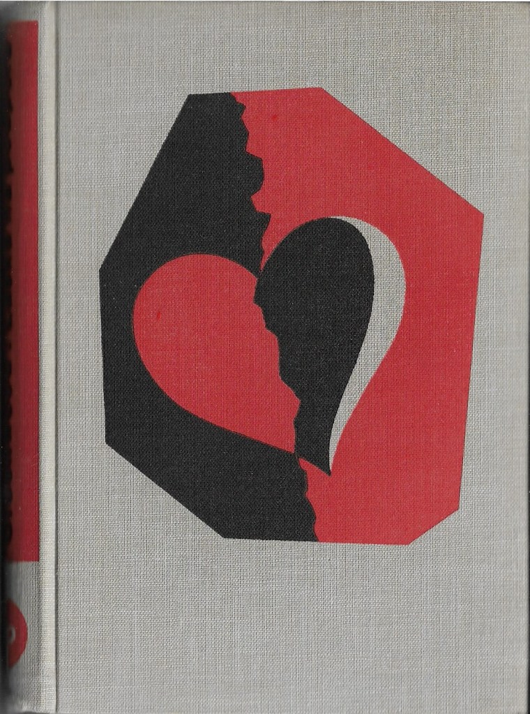
Since the design is printed on the hard cover itself Toyen naturally uses different media and techniques from in the photomontage outer, deploying two bold colour blocks of red and black, plus the background grey of the cover material itself. The design leaves quite a large space towards the bottom of the cover, but fills the centre portion and stretches up towards the top of the space. The design is held within an asymmetric octagonal lozenge or window, and consists of partly mirroring black /red shapes, contrastingly angular and curvilinear, and which like the surrounding frame contain intriguing irregularities to disrupt too settled a pattern. The central red/black pattern can, of course, be read as a heart symbol, through which a jagged break or crack runs, in alignment with the jagged line running from top to bottom of the framing lozenge. It might be that that outer jagged line – which may hint at crumbling brickwork – is the environment of Hanky Park which in the end conditions the inner state of its citizens: a broken heart in a broken space. The red may symbolize passion, but also the heat of industrial furnaces, while the black may represent coal or, as in the industrial landscape on the outer dust-wrapper, oppressive urban buildings. Equally, though, the heart can be – and simultaneously – read as two lovers kissing, like Harry and Helen, and Larry and Sally, in the streets and alleys of North Street: love on the dole. Perhaps the curving sliver of grey (though it looks whiter against the red/black background) is a woman’s hair or headscarf?
If the outer dust-wrapper represents the external industrial environment of Hanky Park, then the inner design appropriately represents its impact on the inner emotional lives of its inhabitants, each design perfectly drawing on respectively the techniques of photomontage and of more abstract symbolic and vivid colour block printing to create their two different but matching commentaries on the human in the Depressed industrial environment. The two designs together suggest great insight into the concerns of Love on the Dole.
It is by no means unknown for there to be a second design on the cover beneath a dust-wrapper, and though this is often only text naming the title and author, there are certainly other examples of two images. (1) What may be a little more uncommon is quite such fully thought-through integration and contrast of theme and technique between the two. The ideal reader of this edition would remove the dust-wrapper to appreciate the inner design, but then replace it (unlike many readers in the interwar period who simply, if incomprehensibly, discarded the dust-wrapper as merely disposable ‘packaging’). I’m sorry I was not in the first instance that ideal reader, but hope I have redeemed myself with this outer and inner reading of the fine two-part designs by Toyen for this splendid translated edition of Love on the Dole from 1937. (2) In future I will always look behind the dust-wrapper.
NOTES
Note 1. Indeed Greenwood and Wragg’s The Cleft Stick also from 1937 has both a dust-wrapper image and a hard-cover illustration – though the relationship between the two is not immediately self-evident, and much less obviously readable together than Toyen’s two images. I do have go at interpretation in my Word and Image article, where broadly I argue that the inside and apparently religious image shows the men and women of Hanky Park meekly accepting their fates while praying for better – the coat of arms is of the Bishopric of Salford. This is despite the general lack of interest in religion in Greenwood’s work, though not of course in Wragg’s – and there is a possible exception in one story in The Cleft Stick (see Word and Image in Walter Greenwood and Arthur Wragg’s The Cleft Stick (1937) *). Both images are scanned from a copy in the Author’s collection.


Note 2. As far as I know this is the first discussion of the second cover image and its relationship to the dust-wrapper image; however, I do not have either linguistic or research access to Czech-language scholarship, perhaps particularly on Toyen’s work, so this is something of a supposition.
