
This is the third set of invaluable Greenwood / Wragg artefacts to be brought to light by the Lay’s Auction at Lanner, Cornwall (13-14 February 2025) of items from the Polperro studio of Frederick Roberts Johnson, incorporating some works from the neighbouring studio of Arthur Wragg. These three associated items were kindly provided to me by Zetetic Books of Berkhamsted (purchased 30 May 2025). They are:
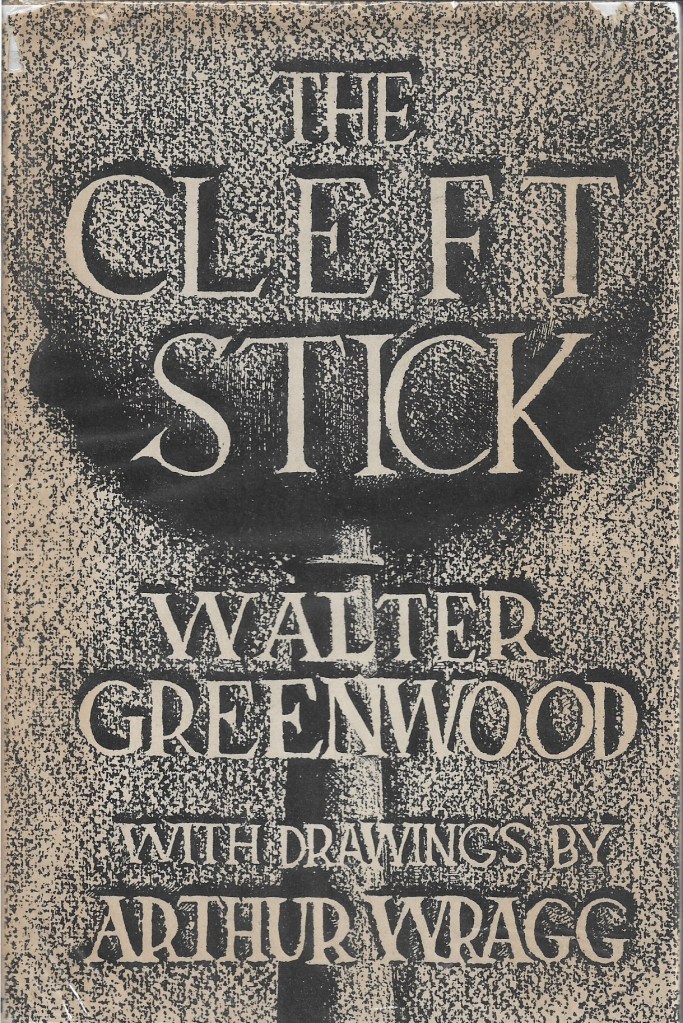
- A copy (presumably Arthur Wragg’s copy) of The Cleft Stick, or ‘its the same the whole world over’ (Selwyn & Blount, 1937) in the Library edition (10/6), complete with dust-wrapper (9 1/4 ins x 6 1/4 ins ; 24 cms x 16 cms).
- Wragg’s original drawing for the dust-wrapper, on cartridge paper mounted on a card displaying the necessary margin dimensions in pencil for its production as a dust-wrapper by the printer/publisher (whole is 15 1/4 ins x 10 1/4 ins; 39 cms x 26 1/2 cms; drawing is 11 1/2 ins x 8 1/2 ins; 29 cms x 21 cms). The margin also bears the pencilled words in Wragg’s hand: ‘DO NOT TOUCH OR SMEAR’ (an injunction I am scrupulously obeying).
- A similar, but distinct dust-wrapper original drawn by Wragg for The Cleft Stick, with some different design decisions (on cartridge paper, 10 3/4 ins x 10 ins; 26.5 cms x 26 cms; includes the design for the spine of the dust-wrapper as well, but no marked-up margin for production as for the final dust-wrapper).
My feeling is that these two original Wragg finished drawings for dust-wrappers are rare survivals, though there are a small number of commissioned dust-wrappers for other authors in the thirty boxes of Wragg’s uncatalogued papers held in the V&A Archives (particularly in the ‘artwork’ boxes, AAD/2002/11). It may be that once the final drawing of a dust-wrapper was sent off to the publisher for production it was not necessarily returned to the artist.
This article will record and discuss the two interpretations by Wragg of The Cleft Stick design, and compare them to the first Love on the Dole dust-wrapper design, analysing the way in which each represented Hanky Park. Here are initial images of the three new Cleft Stick items:
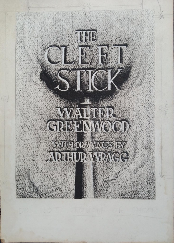

The two wonderful original drawings seem both to be done in the same media. I think as so often with Wragg that the drawing was first done in pencil with the lines then reinforced with pen and black ink. In both cases there are a few very dark areas, perhaps executed with an ink wash for the absolutely black alternative design chimney, while the two sets of industrial smoke may be created through dense hatching with a pen. The lettering in both is notably done through lines and then ink shading around ’empty’ letter-shapes which preserves the tone of the un-inked cream paper, giving white/cream lettering against the predominant industrial soot-speckled smog background. The letters are in a font with serrifs, that is decorative ‘hooks’ at the termination of each letter stroke. This style derives from Latin scripts for use in monumental stone carving, and indeed the book title has a quite weighty monumental feel, even though the letters hang in the smoky air. That background has I think been made through light rubbing of a black crayon against the slightly textured cartridge paper. It must have taken great precision to avoid darkening the intentionally ’empty’ letter spaces, and in fact I notice that on the alternative design a number of the letter-spaces have been ‘coloured in’ with a little white paint or possibly crayon to make sure they are not darkened, or to correct slight errors. Actually in the adopted design too every letter-space has been reinforced with white pigment, very accurately applied. The shading gives the effect of the letters being three dimensional and raised from the surface of the paper in low relief (perhaps like brass lettering on a door and the opposite of stone-carved lettering which would have been beneath the surface of the stone). It is just the top and right-hand surfaces of the raised letters which are shaded black, perhaps suggesting that the surrounding soot has settled on them and stuck. This cleverly suggests what cannot really be: that the lettering is actually there in the pictorial space so that soot from the smoking chimney can settle on their three-dimensional forms.

The differences between the adopted design and the alternative design are relatively few but I think make quite a difference to the overall impression of the dust-wrapper. In the adopted design the chimney is dark only on the left-hand side – a shading effect produced perhaps by light or perhaps by accumulated soot from a prevailing wind-direction – despite the even distribution of the smoke at this particular moment? The alternative design gives us the chimney as wholly black – it is too dark or black or soot-encrusted for any shadow or shading to manifest itself. It is in the depiction of the black smoke leaving the chimney that there is the largest difference between the adopted and alternative designs. On the alternative design the two-lobed pall of smoke drifts to the left in the wind, leaving the top rim and shape of the chimney clear and sharp against the sky-line.
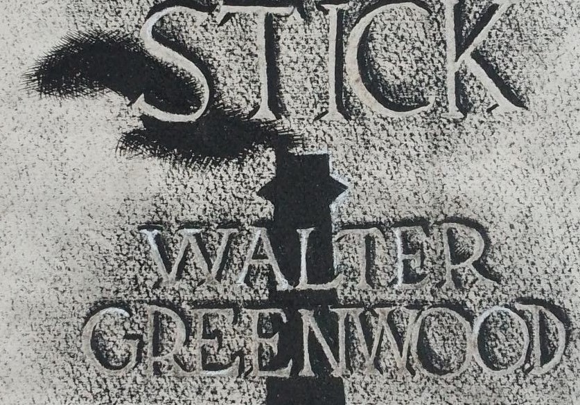
In the adopted design the chimney top and smoke are treated quite differently, drifting upwards evenly above the chimney to left and right, presumably in a wholly symmetrical up-draught. The pall of smoke thus forms a bowl-shape above the chimney and below the ‘Cleft Stick’ lettering.
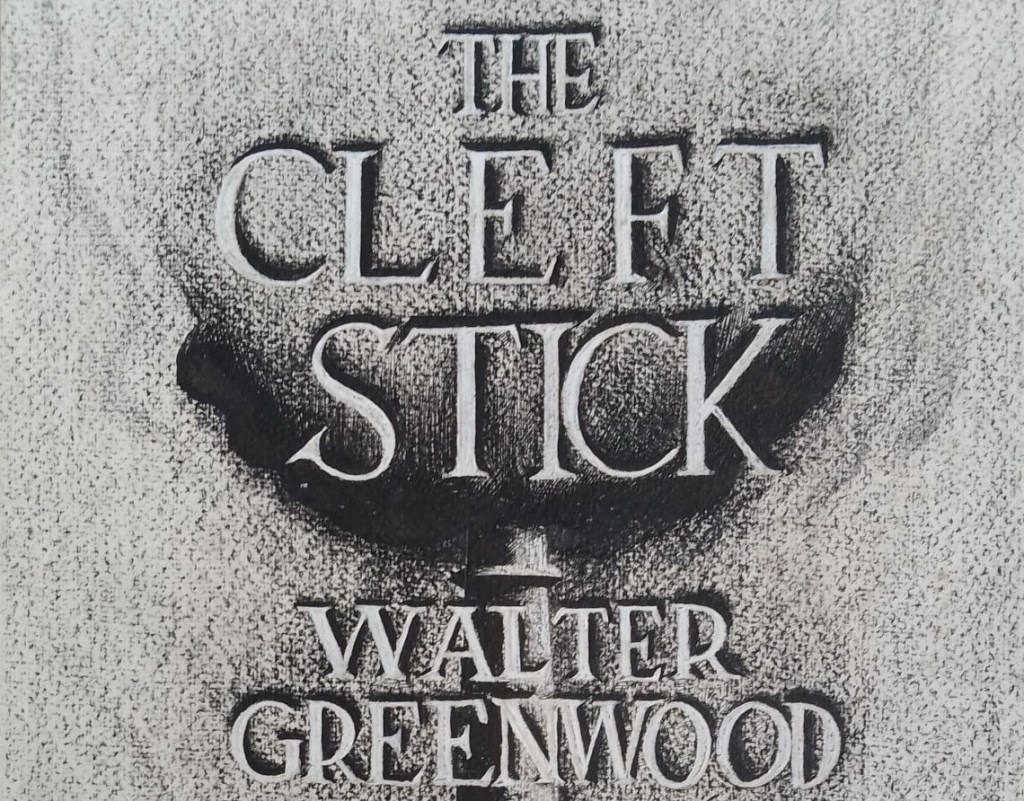
We do not of course know who made the final decision to adopt the published design – Greenwood perhaps in consultation with Wragg, Greenwood and Wragg in consultation with the publishers, or did the publishers have the last word? My thoughts are that it might have been preferred to the alternative design because the bowl-shaped pall of smoke around the title visually reinforced the cleft stick metaphor which runs through the whole story collection – there is no escape from Hanky Park, its industrial, economic and social organisation traps all who are born there and cuts off all escape routes. I must confess that I actually much prefer the alternative design which instead of the rather indistinct and perhaps implausibly evenly distributed smoke around the chimney and title gives a clear image of smoke wind-driven in one definite direction, and leaves the title much clearer to read. Perhaps it would be fair to say that the adopted design is a better metaphorical interpretation of the intentions of the book, while the alternative design is a better drawing of an industrial chimney and foregrounds the splendid title-lettering better.
In both cases, there is a certain continuity with the dust-wrapper design of the first edition of Love on the Dole, as well as some development and distinction. The original Love on the Dole dust-wrapper design was unsigned but I believe it to be the work of J. Z. Atkinson, who did sign another early Greenwood dust-wrapper which looks to me in a related style, if in a lighter vein (Standing Room Only, Jonathan Cape, 1936). (1)

Both the Cleft Stick designs and the Love on the Dole design represent the whole environment of Hanky Park chiefly through the motif of the industrial chimney, though Atkinson also adds some other mill buildings (presumably of Marlowe’s Works) as well as the somewhat mysterious four-fifths completed red circle, which initially looks like an upper-case letter C in a sans-serif font, as also used for the rest of the dust-wrapper’s lettering. The sans-serif font gives a bold, clean and modern impression. The red upper-case letters are shaded in black, like those in Wragg’s Cleft Stick designs, but on the underside, making this a wholly decorative feature rather than a visual comment on the industrial environment. The title is thus separate from rather than part of the cover’s pictorial world. I speculate that the four-fifths completed red circle represents a microscopic section of life in Hanky Park, which will allow us to see into the detail which the industrial works stand for (though such an interpretation requires a considerable leap of faith, as well as implying that the inhabitants are like bees in a hive).
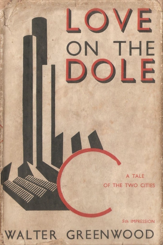
Across all three designs, industrial society is represented mainly or wholly through a piece of industrial architecture – unless we count the large possible ‘section’ in Atkinson’s design, there are no human beings pictured, nor even their dwelling-places (though every single one of Wragg’s illustrations within The Cleft Stick focuses on individuals and or groups of people within their living environment, as does Greenwood’s narrative in both books). There are, however, some very different decisions about how the chimney and hence the industrial environment are represented. Atkinson’s chimney and buildings look as if they are not so much drawn as printed from geometrically shaped blocks – mainly rectangular and triangular, though two have rounded ends, suggesting a curved form for the chimneys. This overall gives an almost cubist effect and a certain modernist abstraction – the shapes are assembled to give the impression of an industrial building but lack any further detail. One detail which is especially absent, and particularly pointed out by its dense presence in both Wragg’s designs, is any smoke from the chimneys or any surrounding smog or dirt. These are completely clean chimneys on a completely clean cream background. I think the illustration specifically derives from a paragraph of description of Marlowe’s Works in the novel, which makes the polluting smoke a clear presence, though I can also see the almost futurist elements of wonder at industrial modernity (even down to the anti-aircraft reference) as seen through the young Harry Hardcastle’s eyes:
Three huge chimneys challenged the lowering sky; three banners of thick black smoke gushed forth from their parapets, swirling, billowing, expanding as they drifted, with ‘unperturbed pace’ to merge, imperceptibly into the dirty sky. A double row of six smaller chimneys thrust up their steel muzzles like cannon trained on air raiders. Tongues of flame shot up, fiery sprites, kicking their flaming skirts about for a second then diving again as instantly as they had appeared. An orange glare reflected dully on the wet slates of the foundry (p.20). (1)
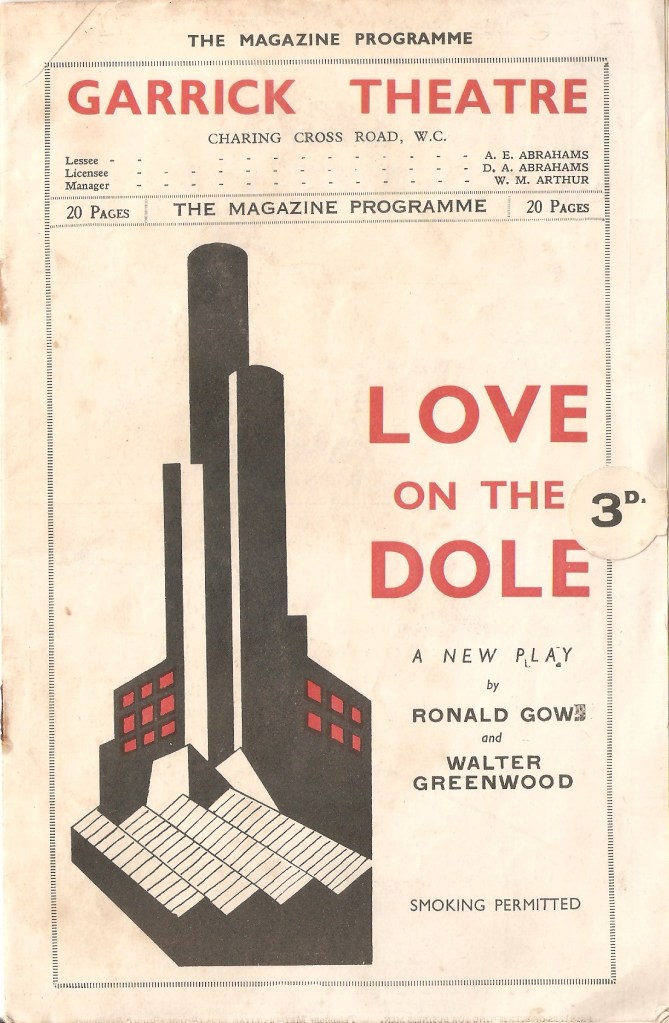
The Love on the Dole dust-wrapper chooses to edit out the smoke to give the clean lines of a smart modernist book-jacket. I do not know that Wragg started by looking at the Love on the Dole design, but it seems more than likely that he knew it. It was an image of Hanky Park which became widely known because a slightly altered version was used at a smaller scale on the programmes for the play adaptation at both the Garrick and Winter Garden Theatres. Indeed, this image became almost a logo for the play of Love on the Dole:
Anyway, Wragg clearly decided to put the smoke back into his chimney image and hence his overview of Hanky Park, giving a much grimier and darker atmosphere. Atkinson’s use of the two-tone red/black colour design was certainly highly disciplined and far from extravagant, but Wragg went for an even more austere monochrome design, so that smoke and smuts issue not just from his chimney, but also form the whole background to the dust-wrapper, and one might say constitute its whole world. These effects are perfectly present in the original drawings, but also noticeably made more prominent and darker by the production process used to print the adopted dust-wrapper. Here side by side are the Love on the Dole dust-wrapper and the adopted Cleft Stick design for ready comparison of their appearance, implications and impact. Against the (counter-intuitively) clean cream background of the Atkinson we can see in contrast the grimy background of Wragg’s cover, in which only the lettering retains any of the cream background on which it is printed.


The alternative design spine or something similar was also not adopted for the final published version of The Cleft Stick, which used a more conventional and text-based rather than drawn design, as shown below (Wragg’s copy of the published book has sustained some water damage). The final published version undoubtedly presents vital information (including, title, joint-makers and price) and, indeed, simply much more information, in a way likely to be more easily legible on a bookshop or library shelf.


Many reviewers of The Cleft Stick felt it had an even darker vision of Hanky Park than Love on the Dole – of course they mainly saw it as a sequel and some felt Greenwood’s vision had darkened since 1933. Thus a review in the Sheffield Telegraph contrasted the (alleged) relative optimism of the play of Love on the Dole and the Cleft Stick stories: ‘There is some good in everyone, but in writing these stories Mr Greenwood preferred to ignore this first point in the humanities. In the play […] this factor received its due respect’ (2 December 1937, p. 2, signed C.B.L.). In fact, of course, most of The Cleft Stick stories were written before the novel let alone the play reached its final form, so perhaps it was the other way round: the novel gave a slightly more restrained view of poverty in Salford during the Depression (for other examples of reviewers’ responses to the short story collection see https://waltergreenwoodnotjustloveonthedole.com/word-and-image-in-walter-greenwood-and-arthur-waughs-the-cleft-stick-1937/ ). Certainly though it seems to me that Wragg’s dust-wrapper (in either version) suggested a grimmer, grimier place than did Atkinson’s. Much as I admire Atkinson’s dust-wrapper I think in the end that Wragg’s sees Greenwood’s environment (in both texts) more accurately and imagines it more atmospherically. Both of his drawings are admirable in conception and execution, and led to a very fine final production dust-wrapper, which lost some detail but overall made the visual idea even darker than in the original drawing/s.


NOTES
Note 1. I have found little substantial information on J.Z. Atkinson but he clearly had work commissioned by London Transport and by the publisher Collins. See https://www.ltmuseum.co.uk/collections/collections-online/posters/item/1983-4-3600 and http://www.classiccrimefiction.com/atkinson.htm.
Note 2. The quotation ‘unperturbed pace’ in the passage is unexpectedly from a poem by Francis Thompson (1907), ‘The Hound of Heaven’, first published in 1890, and about God’s relentless pursuit of the human soul. Greenwood’s use of the phrase to describe industrial smoke would appear, like his allusions to popular song lyrics, to be evidently ironic since in the poem it refers to God’s unhurried but inescapable pace. For the full text of the poem see http://www.houndofheaven.com/poem; for an introduction to the poem and poet see https://en.wikipedia.org/wiki/The_Hound_of_Heaven and https://en.wikipedia.org/wiki/Francis_Thompson.
Note 3. I have discussed the Love on the Dole and Cleft Stick covers before, but not of course with access to the original drawings of the latter nor to Wragg’s alternative design. My conclusions remain broadly similar, but I look at some details rather differently. See https://waltergreenwoodnotjustloveonthedole.com/longer-articles-2/.
